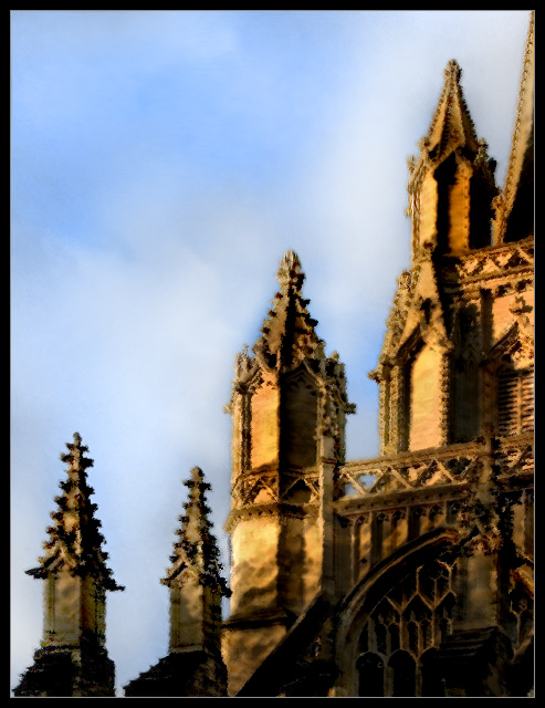
Sorry, I submitted at the last minute and didn't have time to write them. Basically, I used a dark strokes effect and a brush strokes effect on different layers. I then erased different parts of each layer until each part of the photo had the amount of detail and darkness that I wanted it to have. I then dodged and burned and adjusted the hue/saturation slightly.
This was one of two entries that didn't fit what I thought of as "impressionist" but really liked. I gave it a 10. The lighting on the original image must have been great.
Well composed, and the colours are great. A little dark at the bottom maybe.
I'm not convinced this is the best subject for this softening effect though, I think I'd prefer to see tall the detail nice and sharp.
Your artistic take on this piece works quite well, in my unqualified opinion. I like the framing, contrast, and subdued tones. Overall clearly one of the strongest entries and I imagine this should do quite well. 7
I am only commenting and using a place holder score during this pass.
The subject is an interesting choice. I usually like this natural color pallette but somehow think that the picture could do with a little more brightness/lightness. But I'm only saying that based on a personal preference. I think it's the sharp contrast within the towers themselves that throws it off.
balanced composition, nice colors. i like the detail that remains, inspite of the effects used to achieve the result. can't say that i find the image that engaging, though.






 Add photograph to your favorites
 Add photographer to your favorites


 Photographer found comment helpful.


