Challenge:Clichés (Classic Editing) Camera:Olympus C-3000Z Location: My living room Date: Jan 29, 2003 Aperture: f/2.8 ISO: 100 Shutter: 1 sec Galleries:Still Life Date Uploaded: Feb 2, 2003
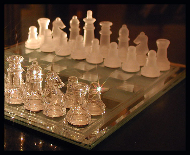
A plain glass chess set and my new star filter. Tricky lighting for the highlights and many shots. Had a hard time choosing. Took a chance with this one
Statistics
Place: 61 out of 246 Avg (all users): 5.9021 Avg (commenters): 6.5000 Avg (participants): 5.7652 Avg (non-participants): 6.1013 Views since voting: 1115 Votes: 194 Comments: 17 Favorites: 0
First Impressions:
Wow! Cool chess set, I wish I owned it. I think your score shows that a lot of people agreed with me! I also think the lighting is a bit dim for the subject, but could that be avoided? I know inside shots are very difficult to deal with.
The composition seems ok with me, although it seems you may have lost points somewhere because of the background being a bit distracting. The reflections of the pieces on the table are also a tiiiny bit distracting.. a nice dark cloth could have saved you from that.
I like the effects of the sparkles on the closer pieces.. did you try actually setting out a game to make the composition a bit more interesting? I suppose that wouldn't be very cliche though. I think in the end you lost some points because the only chess piece that was mostly in focus was on the corner left, with some sparkle on it. Usually that filter works better if ther's only one sparkle, in my opinion.
My own opinion is that this picture definitely meet the challenge, and I also admit that I liked it, and gave it a high score. Good luck in future challenges, I look forward to seeing more of your work! :)
But, all the pieces except the knight have specular highlights. Would have twisted him, or moved slightly, or something. Otherwise like the idea, overall composition and exposure, etc.
Like it, love the lighting & the 'sparkle' effect. Would like to have seen the knight as the center of attention to match the photo's title, my eye seems to be drawn to the pawn (sorry, maybe that's only because I play chess)
Like the idea and the glint sparkling off the clear crystal. Don't like the cropping at all. The frosted pieces should have been either all in the dark out of focus or light on all of it. Whatever is light reflecting in the bottom left corner is distracting. Good idea and consept, just needs better execution.
Absolutely one of the very best shots this week. This is stunning in it's simplicity and it's impact. Congrats, I'll most likely be looking at this all week !
I like the diagonal display, and the color that you've brought into play has a good quality to it. The "star" filter effect is also nicely done. The harsh light on the top left corner on the Pawn and Rook is a bit distracting however, and I would like to perhaps have seen the whole board in focus if possible. The lighting/reflection below your King is also a bit annoying, draws attention away from the pieces on the board. Excellent idea and very creative. . .





 Add photograph to your favorites
 Add photographer to your favorites


 Photographer found comment helpful.


