COMPOSITION
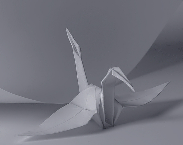
The composition of this is very strong. The placement of the swan gives an excellent focal point, and the "swoop" of the paper gives the picture a nice amount of "movement."
TECHNIQUE
You have done the white on white well. It did take me a bit to figure out that the background was a piece of the "before" paper, so it may need a little more contrast. Though I really like the peacefulness of the solid white, I am wondering what it would have looked like if it had been white paper, white swan, on a different colored background. It may have ruined the effect, but it may have helped with the contrast issue. The focus is wonderful, and it is lit well, I think.
OVERALL EFFECT
As stated previously, the white on white is very peaceful, and that is emphasized by the gracefulness of the swan. These elements couple together to give this a very elegant, graceful look. I am truly surprised it didn't score even higher, but some voters may have missed what the paper was in the background.
Good work.
I love this! The crispness of the paper is gorgeous, and origami is something I enjoy a lot. It seems a little too grey, though. A little bit longer exposure would be more to my taste. Composition is perfect.
this needs more contrast. too gray, or maybe the bottom should be black, and the bird and untouched paper white, and then just do it in "color"... it would give it a natural contrast. Good idea, and good illustration of the challenge.
Nicely composed image and good idea, I regret the absence of tones on both end of the possible range. If you use photoshop, the "auto level" command would have improved that with no effort. 7
Why did you make the pic so small in size (83K). You got some very pronounced jpeg artifacts happening. It is too bad. Composition is nice though. Lighting could be a little better.
This has really good potential. The composition is pretty good. I like the crane and position but I think it should be panned back a little. The other thing is color. My mother's origami paper back when I was a kid was some very wonderful colors and patterns. The black and white thing here doesn't do it for me tho. - Inspzil
challenge met. what a wonderful simplistic idea. i did have to look twice to see the sheet of paper though, and i think that's partially due to the fact that your photo is very low contrast. you may have just tried to avoid harsh shadows, but i personally feel that more contrast is needed anyway. one way i have found of doing that is to put my camera on a tripod on a relative long exposure and pointing a strong light source at the object and then holding a white bedsheet inbetween the lightsource and your photo object. other than that, the curve in the paper is very nice and your origami is, too, i like it.
I have some rainbow banding on my screen from this picture.... usually an indication of neatimage processing, but the pic looks fine in a viewer. I wish I knew how to get rid of the banding.
Great concept, and cute bird. I would like to see the image a bit brighter. It looks a little tooo somber for a lively subject. Very nice composition. Jacko.
I would like to have seen just a bit more contrast so that the paper in the back would show up just a bit better. Excellent creative thinking. It's nice to see something different.





 Add photograph to your favorites
 Add photographer to your favorites

 Photographer found comment helpful.


