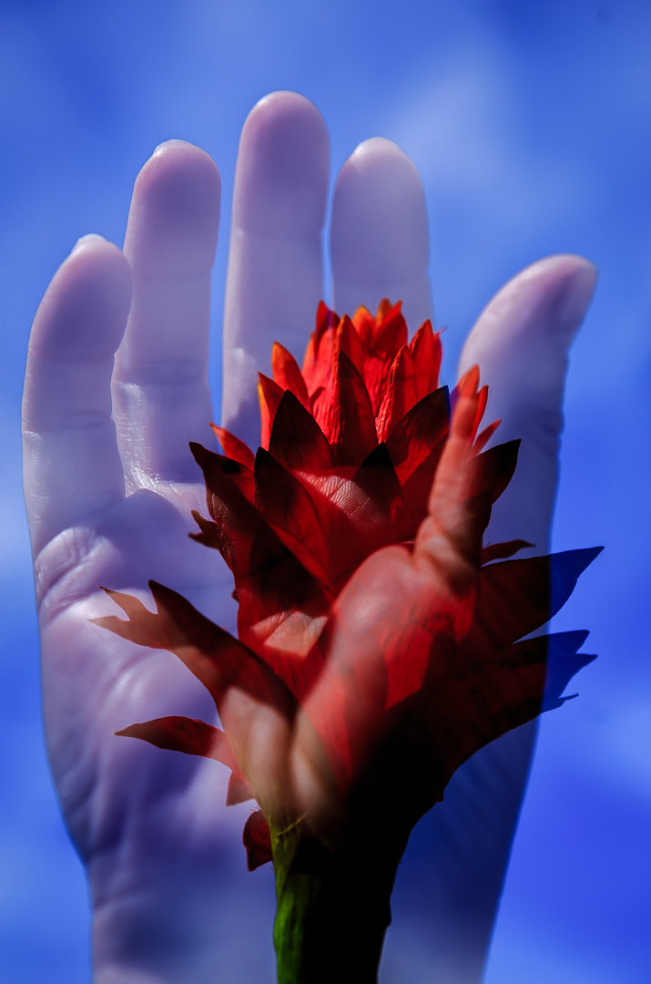
Greetings from the Critique Club! Very interesting image here, Marcel, and had to laugh at the comment about it looking like the cover of a self-help book :-) I do think the way the flower echoes the shape of the hand is very cool, and the colours complement each other well. In terms of getting across the idea of hands, the hand is competing with the flower. That's why I think it finished relatively low. You do have quite a bit of chromatic aberration (aka 'purple fringe' on the right side of the hand, and it looks like the hand texture is overlaid atop the flower, which makes the flower have a skin-like appearance. Overall not a bad idea, tough to pull off, but at least you had a nice clean hand to work with :-)
Susan |






 Add photograph to your favorites
 Add photographer to your favorites

 Photographer found comment helpful.


