Greetings from the Critique Club!
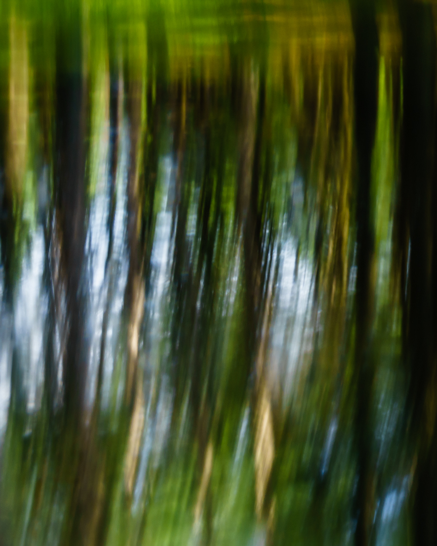
In terms of the challenge ... I agree that abstract can be tough. I think your picture struggled in this challenge because the lines and colors are a bit too uniform/clean. While some of the colors are "dirty" (i.e. browns, etc.) there's a structure and flow to the comp that goes against the "not not rely on clean lines and distinct patterns".
That being said ... the colors are great! I love how the muddy, murky, earthiness of the greens and browns balance with little bits of the blue. The portrait layout is nice as well since it gives height to the pattern in the colors (but the pattern probably cost you in this challenge). I agree with Cutout ... definitely some "dizzy" going on. :) |








 Add photograph to your favorites
 Add photographer to your favorites

 Photographer found comment helpful.

