Greetings from the Critique Club!
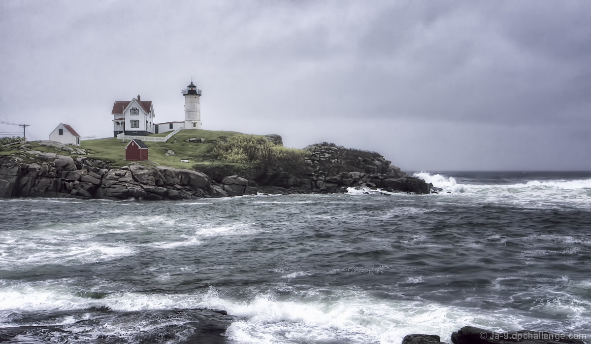
I find this to be an intriguing picture, albeit one seen many times before with the crashing surf/lighthouse/moody sky motif. I do love the way that the buildings look almost toylike on the shore. Use of ambient lighting is good, and I can almost see past the bleachiness on the wave crests ;-) Yet, I also find it bland - centered horizon, washy colours, that phone pole and wires in bg - just looks too snapshotty. FWIW I would try cropping out the last building on the left, I feel it helps to eliminate some problems in comp; a small hit of colour in the buildings to help them pop, and I think it would have done much better in voting.
Susan |








 Add photograph to your favorites
 Add photographer to your favorites

 Photographer found comment helpful.

