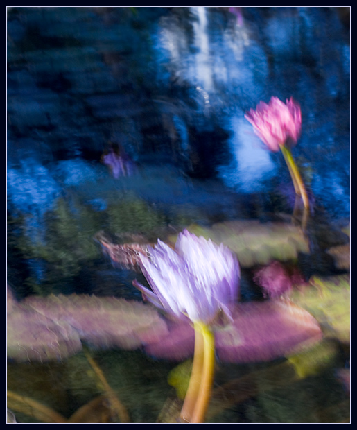
Basic idea is to use a long exposure and move the camera in
small, controlled 'brush strokes' throughout the exposure.
In this case, S-shaped movements were used to give the brush
feel. The camera is actually securely mounted on a tripod
throughout the exposure - just shaking the camera or
kicking the tripod doesn't tend to give a similar
result - looking just blurry instead of more deliberate.
The smallest aperture on the lens was used to get the
longest exposure possible with the available light, with
exposure compensation used to darken the scene to hold the
highlights (based on experimentation)
Post Processing
---------------
Minimal adjustments made. Image was cropped with some
reflections removed in the upper right and a couple of bright
highlights cloned out.
Levels, curves & saturation adjustments and then sharpening.
Resize, add simple border.
Camera Model: Canon EOS D60
Date/Time: 2004:11:06 15:24:32
Shutter speed: 1/6 sec
Aperture: 22
Exposure mode: Av
Exposure compensation: -2/3
Flash: Off
Metering mode: Evaluative
Drive mode: Single frame shooting
ISO: 100
Lens: 70 to 200mm
Focal length: 100mm
AF mode: One-shot AF
Focus point: [Right]
Image size: 3072 x 2048
Image quality: Raw
White balance: Auto
Saturation: Normal
Sharpness: Normal
Contrast: Normal
Custom Functions:
CFn 4: Tv/Av and exposure level: 1/3 stop
CFn 8: Shutter curtain sync: 2nd-curtain sync
CFn 11: Menu button return position: Previous
CFn 12: SET button function when shooting: Change ISO speed
Statistics
Place: 6 out of 39 Avg (all users): 6.9403 Avg (commenters): 8.3438 Avg (participants): 7.1212 Avg (non-participants): 6.9216 Views since voting: 2908 Views during voting: 723 Votes: 352 Comments: 42 Favorites: 8 (view)
Though I'm not a huge fan of the motion blur approach, you found the ideal subject and the colors are perfect. I think with a different approach to the impressionism aspect (a shallower DOF with a very slight motion blur, or shooting through mottled glass, for example), this shot would have dominated the challenge. It still might... one of my top three picks! 9
I just love the colors in this shot. This is the kind of art I could plan an entire room around. I'm no expert on impressionism, photography, or art - but I know what I like. Very nice.
Not quite Monet, but looks nice. Perhaps if this was done in very subtle pastel tones, as opposed to that in-your-face blue, it would have been a lot more appealing. 8 as it is. Edit: on second thought, a longer exposure time with deeper dof would probably increase the effect, yet make it a little softer, because of more vibrations. I presume this was a hand-held shot.
great work It looks like camera shake a bit but you definatley have the right effect IMHO Lovely colours and water lillies are a favorite of mine I would like to have done this challenge and I think this is what I may have tired nice work
This is excellent work. Looks like a combination of camera movement and multiple ripples to do the hard work. Upper right corner's dark area seemed like it was not in synch with the resot of it, but I still had a very hard time when it came to deciding if this was one of the three 10's.
Wonderfully painterly and impressionistic. Well done. If I would change anything here it would be to try and avoid the strong whites in the foreground flower. But the overall effect is excellent.
This was a very difficult challenge to vote on. Impressionism is so very subjective. This work captures for me the vibrance and fluid vibration of nature in a way I can personally relate. Well done and good luck. 10.
I like the colors. I like the post processing effects. I just don't like to see the doublets. It may be that they're intentional, but they detract from the picture. Good luck.
returning for comments: a great effect because the flowers have an excellent background to aid this effect. The image is pleasing and the slight displacement is not at all disturbing like it is in many other attempts. Bumping up.
I like the direction you have taken to create this Impressionistic feeling. The colors work well together. I can definitely see this hanging on a wall.
Good try but I just feel that if there are two components to this photograph (the original image and the camera technique/distortion/filter) then together they don't amount to more than the sum of their individual parts.
while appreciate the affect you wanted to achieve, i wish you had achieved slightly less of it. the colors, lighting, and general composition all work well, but the double-imagery is a little disconcerting.
I really like this. It's one of the best shots I've seen in the challenge. My choice for the red ribbon. Edit: forgot to add, this has an awesome Monet feel to it.
Oh wow, now THIS is a great response to the challenge. Great pastel colours, and I really like the blues. Wonderful use of painting with camera movement. My favourite response to this challenge. 10
that white flower is in an awkward spot. it's too central and too close to the front. if it weren't there I think the composition would be more pleasing






 Add photograph to your favorites
 Add photographer to your favorites

 Photographer found comment helpful.


