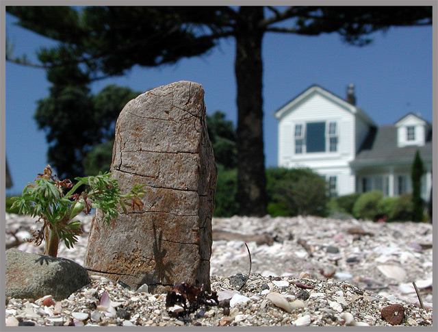
Kick some sand, arange an piece of wood to make a "big rock", scratch around for a miniature tree (the hardest part!) then try to find shadows, symmetry, linking space and depth on a non-SLR camera's LCD screen in bright sunlight down the beach. Select shot from around 12, Crop, Sharpen (more) PS. Done.
Oh.. camera lens is about 4 inches from the "rock". And I felt the neutral frame was somehow needed for this shot... it just seemed to cry out for framing. Not exactly sure "why".
This is my first attempt ever at this sort of thing. I'm a complete novice. Discovered DPChallenge two days ago, signed up today - just in time for this challenge. Go ahead - I *want* the criticism - the more (constructive) the better. Thanks! :)
Statistics
Place: 315 out of 528 Avg (all users): 4.7539 Avg (commenters): 4.5714 Avg (participants): 4.5904 Avg (non-participants): 4.9850 Views since voting: 979 Views during voting: 397 Votes: 321 Comments: 8 Favorites: 0
I'm embarrased about the frame. It really does flatten out the contrast! Thing is, I put that on to enhance the contrast on a black, full screen display without a second thought that the DPC background is neutral grey. Doh! Foolish of me.
In hindsight, the crop should have been much tighter at the mercy of the symetry I had aimed for while taking the shot. That might have given it more of a macro feel - but I was working on the "or at least extreme close-up" aspect of the challenge description. (That "rock" is a piece of wood about two inches tall. The foreground tree is a one inch high weed clipping.) The image as a whole does not make much of that obvious. A flaw to be sure.
"Fractal" was about the shapes. The shape of the house's roof and that of the "rock", the shapes of the tiny foreground tree and the large background tree (and that they are both "trees".)
I think I tried too hard on this. I was trying to get too much out of one picture. I should have just let it flow I think. The "KISS" principal maybe.
The DoF is great, so we can still get a sense of scale from recognising the house, but it doesnt distract from the subject. I'm not a fan of the grey border though. It flattens the contrast.






 Add photograph to your favorites
 Add photographer to your favorites


 Photographer found comment helpful.


