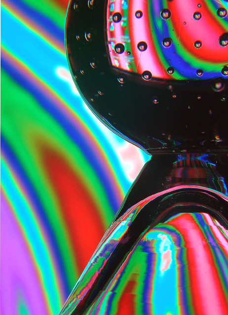
A martini glass standing in front of my computer monitor. Cropped, rotated, and flipped. Adjusted levels, contrast, lightness, and saturation. I really wish I could have done some spot editing on the glass, but that's against the rules so I left it as is.
Statistics
Place: 156 out of 528 Avg (all users): 5.2727 Avg (commenters): 5.4286 Avg (participants): 5.0246 Avg (non-participants): 5.6693 Views since voting: 824 Views during voting: 428 Votes: 330 Comments: 11 Favorites: 1 (view)
I was initialy amazed at this shot the colors. the bubbles. I was in rapture... well not quite but I liked it. Then I notced the desk top icons on the ball. slowly the process came together. and I realized it was just the reflection from a monitor. It was not some brilliant lighting schem as I had originaly thought. Then I was sad. T put it simply this went from a 9 to an 7 just because of the icons. This is a great shot I would definatly have to reshoot. and add to my portfolio. Not trying to be harsh but i feel that honesty is the only way to improve.. keep up the good work
After looking at this for awhile, I think I've decided that it's just not my thing. I tried, I really did, but after a lot of consideration, without trying to be mean, I just don't like it. There's some goofy lines and smudgy looking marks throughout the glass and to me that seems odd and out of place. The one that stands out to me most is near the bottom center of the photo in the 'green/red' upside down V, there is a horizontal 'invisible' line going through it chopping it in a strange way. the colors are interesting, but all of the color is soft focus, and I'd like to see it crisper focus. This is just my own personal opinion though. ~Heather~





 Add photograph to your favorites
 Add photographer to your favorites


 Photographer found comment helpful.


