Greetings from the Critique Club!
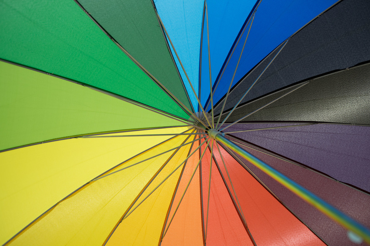
I love that you went to a home improvement store to help you with this challenge. I definitely wouldn't have thought of that one. The umbrella is definitely a colorful subject and the range of shades represented is terrific. Clearly a fit for this challenge. The off center composition is wonderful; and the supports create nice leading lines to highlight each segment. Two things that detract at least for me ... 1) the out of focus know in the bottom right clutters up the clarity of the lines and segments; and 2) the vibrancy of the colors feels a bit off. I like the shine and textures of the color segments but there's just a touch of "oompf" (horrible technical term - but I don't know how to describe it) that would kick it up a notch. That being said, this is nicely executed. I may have to visit a hardware store. |







 Add photograph to your favorites
 Add photographer to your favorites

 Photographer found comment helpful.