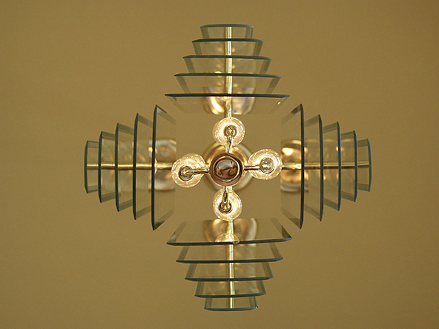
I really like this. I think I would have moved it further to the right so that there is an equal margin on the top, bottom and right hand sides (and then maybe see if it looks better as a vertical with the lamp at the top or at the bottom or if it looks better horizontal). If possible (and it may not be) I'd also try to make sure that the fixtures in the middle were all squared up.
This is a great example of taking a very common object and illustrating its beauty. I applaud your attention to detail in your composition. Give us more of this good work.
I like this shot! This painfully reminds me of my "quittin time" clock shot from last week. My idea was to produce a photo that was as close to technical perfection as possible. This photo is nicely centered and I can see ZERO flaws. It also meets the challenge nicely! Nice job!
This is a very neat effect. It looks a little uneven but I think that's due to it being a light as they tend to do that. I'm so happy it wasn't against a white wall as this color just adds so much to the photo:)








 Add photograph to your favorites
 Add photographer to your favorites


