Hello from the critique club
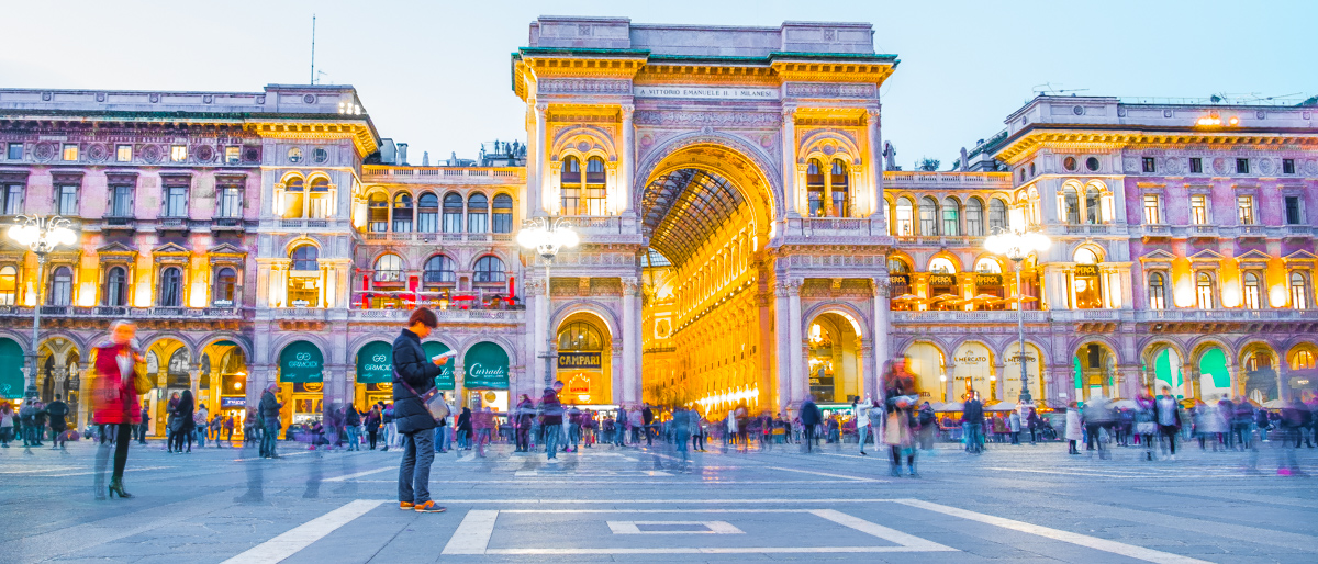
An appealing image that meets the challenge
I like your low viewpoint and use of motion blur from the long exposure. The placement of your main person is good with lots of added interest from all the other people too. I agree and disagree with one of your commenters, I agree that a little less exposure would help the saturation of the colours but I disagree about the composition. I like the lack of symmetry but more important if you had done as suggested you would have lost that love golden arch and inner wall, that is such a powerful element in the image it needs to stay. You could perhaps have altered the composition by moving it further to the right. All in all good creative vision well done Jonathon. |






 Add photograph to your favorites
 Add photographer to your favorites

 Photographer found comment helpful.


