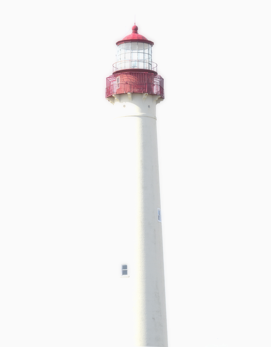
If only a dat bit details of the tower, it will be wonderful. The left outline of the tower, to me, had merged with your effort of high key background.
I do like this, but for me aesthetically it would've been more effective with more white space to the left hand side.
I find it works better as a thumbnail/smaller and I think more negative space could enhance that.







 Add photograph to your favorites
 Add photographer to your favorites


 Photographer found comment helpful.

