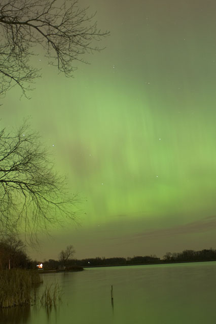
The green is nice, but the tilted horizon is really distracting. Other than that, it's good. Maybe the colors are a little flat too. I know it's night photography, and I'm not very experienced in it, but I think that the is too much gray. Maybe? I don't know. Something isn't sitting right with me about it, though.
The leaning of the horizon works badly for this photo, you should have had this a little darker, it's like too long shutter speed maybe. Aurora is great to experience and fun to photograph.
Last I heard, Aurora was not a month. The colour of the aurora is nice, but the whole photo is green, which is not so nice. Also the horizon is badly titled to the left.
Aurora is not a month...
Its a good photo to start with but i feel you could have made it a llot better with some post processing. For starteds your horizon line is not even, and the bright light in the lower left could have been taken out... also levels would really help with the contrast and make the aurora really pop out against a darker sky.
Not at all a bad shot so don´t get me wrong. The tiltet horizon though spoils it a bit and it´s taken with a slightly too long shutter time, to get the best results try to keep it as short as possible because otherwise it gets very smudgy, like in this shot. Great setting for an Aurora Borealis shot though, better luck next time. 7
Oops, you should have titled the picture with the Calendar month. This doesn't meet the challenge but it is an excellent shot. I'll give you 7 for the shot alone, nice one. (PS you might also like to straighten the horizon..)
I know you've likely heard this more than a few times, but... "Your photo title should be the month to which your photo belongs." No idea what month you're going for... Aside from that it's a nice image. I love the color... The horizon seems a bit sloped... But that's just me, and what do I know? :)






 Add photograph to your favorites
 Add photographer to your favorites


