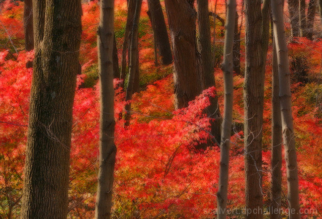
This is an area of red underbrush about a block from my house. I walked over there this morning to see if I could get something appropriate for Impressionism. No dice, but it looked promising for Calendar. ;-)
The original was pretty drab. I cropped and used the Shadow/Highlight filter to bring down the highlights (a lot). Then I pushed up the saturation, and shifted the hue just slightly. Following in Dsidwell's footsteps, I used a heavy Gaussian Blur and then faded it back several times to get that "magical" soft focus. I dabbled with spot saturation, dodging/burning and sharpening, but really could have finished the image with Basic Editing. This is my first attempt at a softer focus, so I'll be interested to see how it's received.
Statistics
Place: 33 out of 190 Avg (all users): 6.2189 Avg (commenters): 6.9000 Avg (participants): 5.8889 Avg (non-participants): 6.6022 Views since voting: 2122 Views during voting: 311 Votes: 201 Comments: 17 Favorites: 7 (view)
Thanks, everybody! I was surprised this one didn't place higher since it's so "calendar-ish," but the soft-focus look was a big experiment for me and I understand those who will vote it low for that. Still one of my personal favorites. ;-)
My highest scoring image in the challenge.
I`m genuinely shocked to find that it`s not in the top ten.
Too many "soft image" haters out there...I`ve found to my cost!!!
Although there are many ways to end up with this type of picture..it`s amazing how many attribute it all to "Neat Image".
Excellent shot--the color and aesthetics are wonderful. This is very nice and impressionistic in quality. Amazing how well this works even with it being a horizontal "slice".
Certainly a pretty scene, although I'm getting that NeatImage feeling again! It is a heavily effected photo which draws my attention away from the subject and back to the processing.
However, as a calendar it would work but in my view it would position the calendar further down-market due to the digital assistance in the shot.
Love the colors... wish there were details in the leaves (I'm not a big mordern art fan, otherwise this would probably be a 10 because the colors really are beautiful).
This is definitely my kind of image..I love the detail in the bark, the colours in the foliage and the overall effect.
This would make an excellent calendar shot...9








 Add photograph to your favorites
 Add photographer to your favorites

 Photographer found comment helpful.


