Hello from the critique club
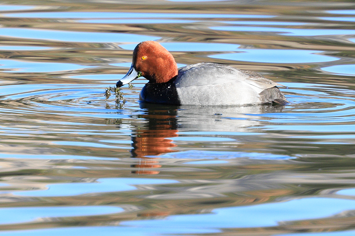
An appealing image that meets the challenge.
I do agree Richard, that is definitely a red in my book too. However, the dominant colour here is the blue, its the first thing that hit me because it is spread throughout the image and whilst reds are normally so powerful in attracting your attention, the red here is secondary to the blues. In itself it is a lovely image, well executed with nice sharpness where its needed on the ducks eyes. I like the DOF and the nice soft foreground and background but I would prefer a less central composition, a diagonal using one of the hotspots would have greatly improved the end result. The standards of the rest of the entries need to be high to justify the placing…? I've only just seen dtremain's comment, I agree. |






 Add photograph to your favorites
 Add photographer to your favorites

 Photographer found comment helpful.


