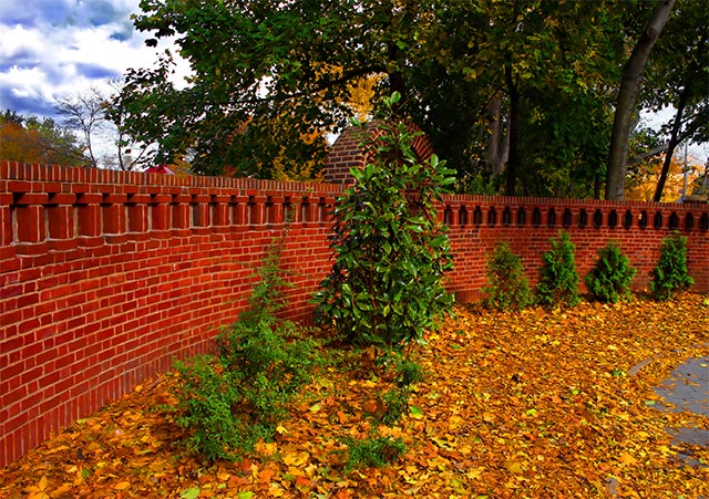
A lovely image with a great brick fence to carry the eyes. I am going to suggest a few changes, not at all to alter this image, but to aid you in future comps. One alternative is to move the angle of view so that the brick arch is not covered by the tree. The eye is following the top of the wall and the tree or shrub covering the arch present a desire to see behind the tree. The next suggestion is simply the reduction of the saturation as the image is slightly on the red. Less saturation will also help the sky and give it a more silk-like feel.
Again, these are merely suggestions which will bring the image a better focal point and a more comfortable look. However, you are the judge. My approach is usually to reduce saturation a hair because scenes with a preponderance of color, red in this case, suffer the danger of having this color favored. Pushing the reds will adversely affect the blues and create a minor unbalance.
Outside of this, I like the image in general. The wall is just great.
The colours are what atracted me to this shot and they are great. The worst thing for me is that its just a bit ordinary in its content. With an "ordinary" scene like this you need to find a dramatic viewpoint and / or have some extraordinary lighting. The lighting here is a bit flat, there are hardly any shadows being cast. How about being right up against the wall or right down at ground level, don't be afraid to experiment with the veiw ans look at it through the camera to see what it sees, things can look very diferent from our own eyes. Well done though, a five from me.
Interesting shot. I like the "confusion of seasons" from the contrasting dead leaves and very much alive greenery. Given the autum foliage in the background also, I would like to see the half-length top of the fenc just below frame center to balance earth and sky more. Exposure is perfect imo.
Very nice Framing of the picture. The colours are nice and warm, even for a November application. Perharps would've been a little nicer without the gray darmac on the far right. Perharps with a clever croping, it could be removed without loosing too much of the wall. If a chance comes, a re-shoot of this location, but from a lower perspective would give good results, perharps in catching more of the sky to create a good contrast with the red and green...







 Add photograph to your favorites
 Add photographer to your favorites

 Photographer found comment helpful.


