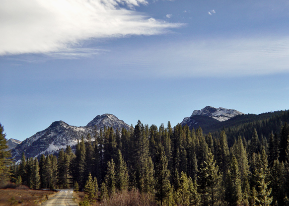
Lacks the punhc, the highly orthodox standard photographic approach to landscape that I'd expect of a calendar. A good enough scene, in itself, and in your chosen composition (although I think a more draatic cloudscape would be effective), but the light is not great - no sense of shape to the mountains, no warmth, and a sense of the image being cropped too high. You've done well howeever, to place the horizon strongly in frame, and to find those parallele shapes of tree-line and hills. Close - but it needs to be more imposing, to my eye.
I like the road. I would crop the sky down a bit. Having so much sky minimizes the mountains for me. Nice lighting - light in the foreground and background with the midranges darker adds an interesing twist.
This is very nicely framed, but it somehow lacks clarity and communication of season - despite the melting snow on the hills. The cropping is good, exposure seems right, but there's a lack of depth and realism somehow. Perhaps some experimentation with aperture and focus if possible? The balance of sky to ground is perfect and I like the mirrored arcs of the tree line to mountain saddle making this a good composition overall. 6.





 Add photograph to your favorites
 Add photographer to your favorites


 Photographer found comment helpful.


