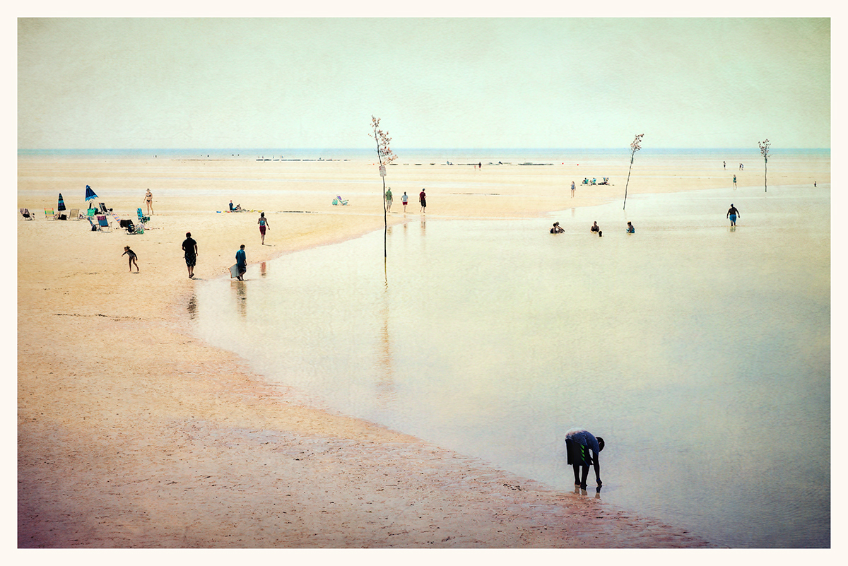
The saplings are channel markers. They are put in at low tide every spring to mark the channel for the year, as the channel itself changes every winter and resetting conventional buoys would be too expensive. Rock Harbor is a very small harbor, perhaps 30 fishing boats in total.
Statistics
Place: 12 out of 150 Avg (all users): 6.2347 Avg (commenters): 7.2778 Avg (participants): 6.3158 Avg (non-participants): 5.9545 Views since voting: 724 Views during voting: 229 Votes: 98 Comments: 22 Favorites: 1 (view)
Cheers Bear! Glad the image did well. My comment via the Art Jury:
Quite a beautiful image with lots to look at. Splitting the image itself into 4 would create separate pieces that work on their own with their own stories to tell. So it's quite the splendid composition. The color palette is very reminiscent of J.M.W. Turner. The color portraying the mood, a hot Summer day, with the smaller human elements of detail and then the vaster landscape surrounding it. The subtle application of texture is perfect. Doesn't distract the eye but seems to add a considerable feature that tones down what might've been an overabundance and strips it down to the minimum. Yet plenty of focal points but not overwhelming to the eye. There's a sense that I can look into the image as far as the eye can see. An enjoyable image to come back to. It doesn't get old.
Beautiful vintage tones on this image.I Possibly, maybe would've cloned out at least one or two of the trees, actually maybe just the one in the middle, they can be rather distracting IMHO, already voted.
So much to see here, from the multiple shorelines to the trees right at the water line (did you extend them?). The toning is wonderful. Makes me wonder where this is and why it isn't closer to me.
For me, this doesn't represent the sort of image I'm hoping to enjoy in this challenge. Of course there's nothing technically wrong with the image, but it holds little interest for me. I'm one of those DPC members that likes the blur, the texture, the unusual motif and will often be pursuing the 'posthumous' thread. You'll know yourself that this isn't that sort of image - for which some voters may be very pleased! I'm just not one of them.
For me the 'Art' challenges are about embracing the avant-garde, going beyond (or falling short of) conventional representations, this image doesn't really do that for me; but I do like the overall scene and coloration - enough for a (not disastrous) 6.
This is one of the most pleasing beach scenes I have ever seen. The trees and the people all seem to be perfectly placed and the processing is really lovely.






 Add photograph to your favorites
 Add photographer to your favorites


 Photographer found comment helpful.


