Greetings from the Critique Club!
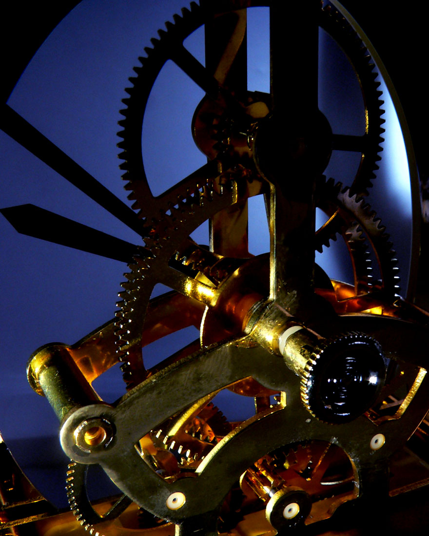
This is a very nicely done that meets the challenge, a pleasing shot of the innards of a mechanical clock with all the inner cogs and wheels exposed. Love the complementary colours, the play of light off of the machinery in foreground and mid ground especially. The background bits just don't show up quite so well, though, and the loss of detail means that the eye is looking for something more - and then it goes to the odd back-right area of the shot where there is an unexplained light wash on the blue, whereas on the other side of the pic everything is dark. It just throws the viewer off a bit.
Something else that isn't quite working in your favour is the portrait orientation. Generally it's best to go with a square crop or horizontal orientation, because if voters have to scroll down to see the whole image, the impact tends to get lost.
Hope this critique has been of help, feel free to pm me with any questions.
Susan
|








 Add photograph to your favorites
 Add photographer to your favorites

 Photographer found comment helpful.


