When I started searching an idea for this challenge, I didn't know that traditional mail was called "snail mail" in English. So when I discovered it, I was quite fresh to the term, and immediately understood the obvious way of using it in an image. It sounded fun, so I decided to start working on it.
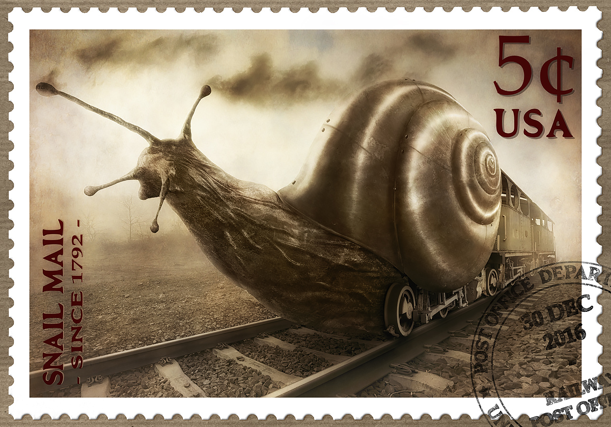
The initial sketch was straightforward: since it was supposed to be a postage stamp, I didn't want to include loads of details and small shapes everywhere, it had to be simple. I simply decided to turn the snail towards the camera, with a relatively wide lens, to make things punchier. From there, I went out for some photo hunting!
Regarding the snail shell, the editing was a bit tricky: I had to fully texture it using photos of metal parts, bending them to follow the original spiral shape. It took a few very boring hours, so I'm glad you liked the results :)
Thanks a lot for the great votes and comments, they made me very happy!
Statistics
Place: 1 out of 29 Avg (all users): 7.9615 Avg (commenters): 9.2000 Avg (participants): 7.8125 Avg (non-participants): 8.0278 Views since voting: 5107 Views during voting: 135 Votes: 52 Comments: 30 Favorites: 4 (view)
Maybe for the first time I didn't recognize your image in a challenge. But when I saw this one I was sure it should be the winner - and I was right. The concept/title is perfect so it's not a surprise to see this one getting the blue!
really great stuff. very funny too. enjoying this immensely :)
can i ask in the top middle, is there a patch of blue, or is it just a darker patch and a trick of light makes it look blue? half way along the image. at the top. just under the frilling.
Thanks a lot, very kind of you :)
Yes you are right, there is a patch of blue there. I didn't apply the toning at full opacity, so that some colors of the original photos would survive in the final image (even if the effect is very subtle). I thought it would be a bit richer this way.
really great stuff. very funny too. enjoying this immensely :)
can i ask in the top middle, is there a patch of blue, or is it just a darker patch and a trick of light makes it look blue? half way along the image. at the top. just under the frilling.
Huge Congrats Christophe!
This was my only ten- not only well crafted, the snail mail idea with its humour is outstanding. The snail house even looks like made of metal. Awesome.
Did you notice- putting this muddleheaded 1 aside - your worst rate was a 6....
There are several nice looking stamps in the challenge, this one in particular pays homage to mail being old as mentioned in the challenge description. It is also very well crafted with attention to detail (and one of the most realistic postmarks). Nicely done.





 Snail Mail
 Add photograph to your favorites
 Add photographer to your favorites

 Photographer found comment helpful.