rotated, cropped, slightly sharpened.
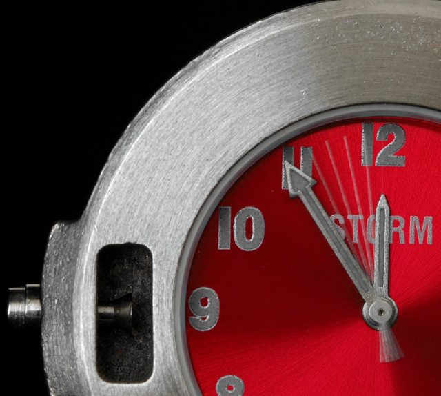
the dial of the watch is originally blue and has green fluorescent numbers, both of which i did not like on the image ... so desaturated greens and shifted the blues to the red (both with photoshop hue/saturation tool applied to the entire image) ... looks more threatening this way
Statistics
Place: 72 out of 528 Avg (all users): 5.6319 Avg (commenters): 6.8000 Avg (participants): 5.5098 Avg (non-participants): 5.8361 Views since voting: 768 Views during voting: 408 Votes: 326 Comments: 6 Favorites: 0
This is similar to the picture in the time challenge i saw with the second hand action. Adds interest, but... I don't know, something is missing. For some reason, the composition does not seem balanced to me. The red works well though.







 Add photograph to your favorites
 Add photographer to your favorites


 Photographer found comment helpful.


