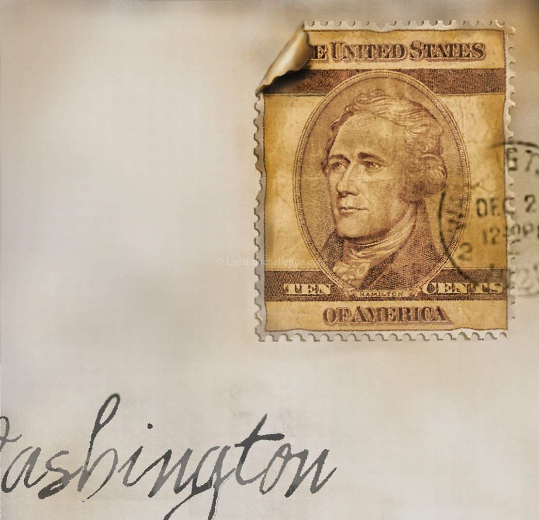
I enjoyed it... the creation of it from "scratch" (a ten-dollar bill)... but getting it to where I thought it looked marginally real... what an ordeal to make things look imperfect, perfectly. :D
For instance... the last adjustment I made was to skew the stamp just slightly. I'd had it perfectly aligned... which would never happen... before.
It's amazing to me how I miss stuff like that... for days while I'm editing, and only figure it out three hours before rollover.
I hope you're sufficiently off balance enough.
I'm particularly pleased with the "hand-written address"... but I'm certain some will hate the "crop" which is actually a "creation".
Wonderful tiny violin! Looking at your comment you did a very great job. As for the voting I think markwiley made the right comment during the challenge.
An excellent image that contributes well to the challenge
Your appreciative commenters have already summed it up for me Lydia, as Mark says, 'a masterful job'. I think he may also be right about the under-rated voting, your image is just so convincing and they did not have the benefit of your comments like I do, its a real shame it didn't feature much higher it certainly deserved to. I love the hand writing except that, the only minor criticism I can make, is the faint line to the right of the g. Yes Lydia, I love your creative crop it works perfectly. Thank you for persevering and doing such a marvellous job and sharing it with us all, I and your commenters certainly appreciated it.
Wow. This looks like a legit old stamp. So much so, that I wonder if that might be hurting you in voting (i.e., people assuming you simply photographed a real stamp rather than create one). I am also impressed at the job you did on the handwriting. Nicely done.







 Add photograph to your favorites
 Add photographer to your favorites

 Photographer found comment helpful.


