Thank you all for your nice comments.
----------
For this challenge, I went to the Home Depot in the Electrical Accessories section and I saw this 250v switch in which you can see a face. Once at home, I wondered how I could be creative. I left the switch on the counter and by accident the sun created shade that would become the final point of my composition.
Your commentaries are welcome
Statistics
Place: 3 out of 35 Avg (all users): 6.4000 Avg (commenters): 7.4000 Avg (participants): 6.5500 Avg (non-participants): 6.3250 Views since voting: 1244 Views during voting: 122 Votes: 60 Comments: 10 Favorites: 1 (view)
Hey Marcel, well done! I've only just seen your latest addition to your ever-growing ribbon collection and what a worthy addition it is, great use of natural lighting with a humorous feel to it which is always welcome. I'm proud of you, keep up the good work...
I really enjoy this image. It was one of my highest rated images. I have a strong preference towards strong graphic qualities in my own photography - and this picture is the epitome of a graphic image. I really enjoy the strong basic shapes in this image, with the clean, strong lighting. It's a familiar image to us now-a-days, particularly because its reminiscent of an emoji.
Photography is all about light, and I think this image supports that. The lighting from above matches the lighting that is most common on human faces, so we get a familiar shadow on the emoji's eye sockets from the brow and nose that really brings out the link and stimulates the brain.
The biggest gripe I have with this entry isn't the photo at all - its in the title. I love the image - hate the title. I don't see the link, and to me, a good title on DPC should have a strong link with the image. Sure, that particular expression on a human could mean "its too hot", but it could also mean many other things. There's nothing in this image that links me to 'hot'. Maybe I'm just missing it. To me, some sort of reference to a pillory or maybe a hermit would be a better fit. That might bring some added dimension or comprehension to the image that would help bring some depth and emotional backing/linking.
Editing-wise, I have no complaints or criticism. It doesn't appear overworked - the B&W works fine here.
Overall, I think its a simplified, well-conceived, strong graphic image with a good clear subject. I think it was just missing that link to the human emotion (that, if you note, the top shots in this challenge seemed to have a little more of).
Hopefully you found some grain of insight here. Cheers.
One of my 7s. Always glad to see you on the homepage, even better to see that you saw the sun and shadows and knew to catch it. Congrats on the HM! :-)









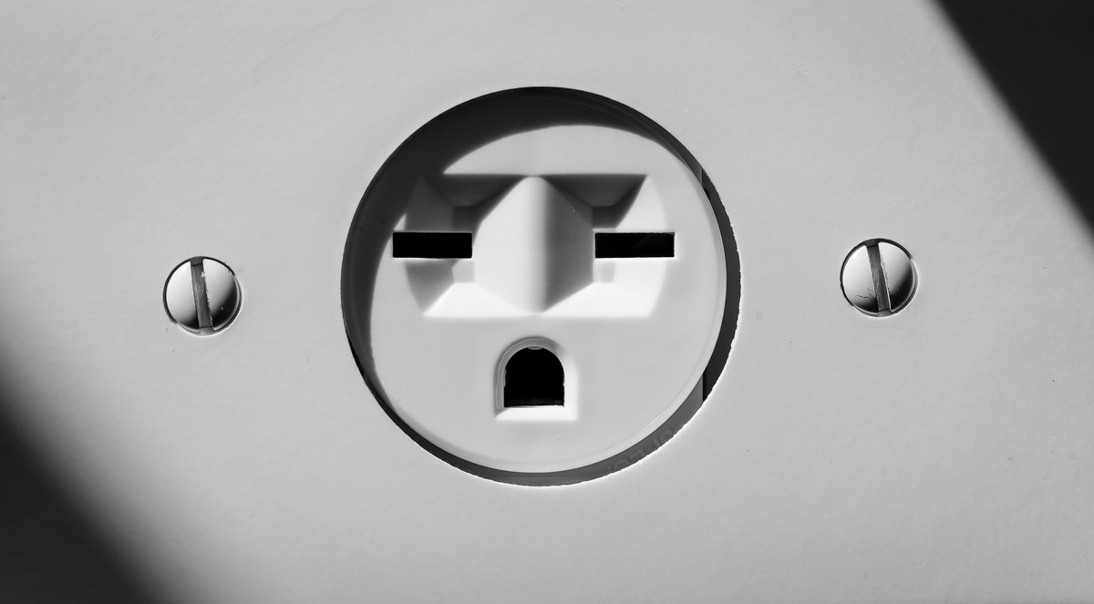
 It's too hot !!!!
 Add photograph to your favorites
 Add photographer to your favorites

 Photographer found comment helpful.


