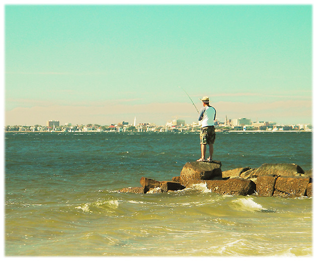
Originally shot with a polarizing filter. I wanted a highly stylized color palette. For some reason it seemed right for a calendar.
Curves Adjust. Zoom Blur layer overlay. Soft Yellow layer overlay. Selective USM of some edges. Gaussian Blur overlay of sky only to get more gadient toward the top.
Further color adjust. Overall USM. Soft border.
I chose September as a month name because I thought it would make sense for viewers from points north of me, and also as an early season shot in the southern hemisphere.
Statistics
Place: 149 out of 190 Avg (all users): 4.8985 Avg (commenters): 5.6364 Avg (participants): 4.8585 Avg (non-participants): 4.9451 Views since voting: 915 Views during voting: 287 Votes: 197 Comments: 12 Favorites: 0
Something's off with the colors with this one. The guys shirt should be white but it's got a blue color cast. Was this what came directly from the camera?? It is a nice shot though, I wish I was there fishing for the day!
Very nice, this image seems to have a "watercolor" look to it, which the border accentuates. This style may not appeal to most, but your shot is among the top for me, good luck.
The image is interesting but the treatment given to it is not. It looks all smudged. Doesn't look like a photograph (this could be bit of a stretch). But, my point is, this looks like the result of a badly exposed photograph forced to look nice with processing, or a really good photograph with too much messing about.
I like the compostion and the subject matter.
Nice shot but, the blue colour cast seems to detract from it for me. Also I think having the horizon right across the middle of the shot here doesn't work to well. I think more of the sea, (where there's some movement) and less of the bland sky would have worked better. For the record I think the border is great, well done a six from me.
not sure i'd have chosen the high-key approach here, but then again, it's not my photo :). granted, you'd lose some detail on the fisherman, but you'd get some back in the skyline, and add some needed contrast in the beautiful sky to really make him the focus of your pic. Using curves or levels would let you darken the darks without messing too much with the lights...
I'm all for trying new things and getting away from traditional technically oriented shots, but this one to me needs more contrast.
The graduated border does nothing for me, but is irrelevant to the shot so doesn't affect the score.






 Add photograph to your favorites
 Add photographer to your favorites


 Photographer found comment helpful.


