I always appreciate comments so thank you to all who gave me one on this entry. mariuca's is especially nice - thoughtful, critical AND constructive, and encouraging at the same time.
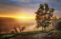
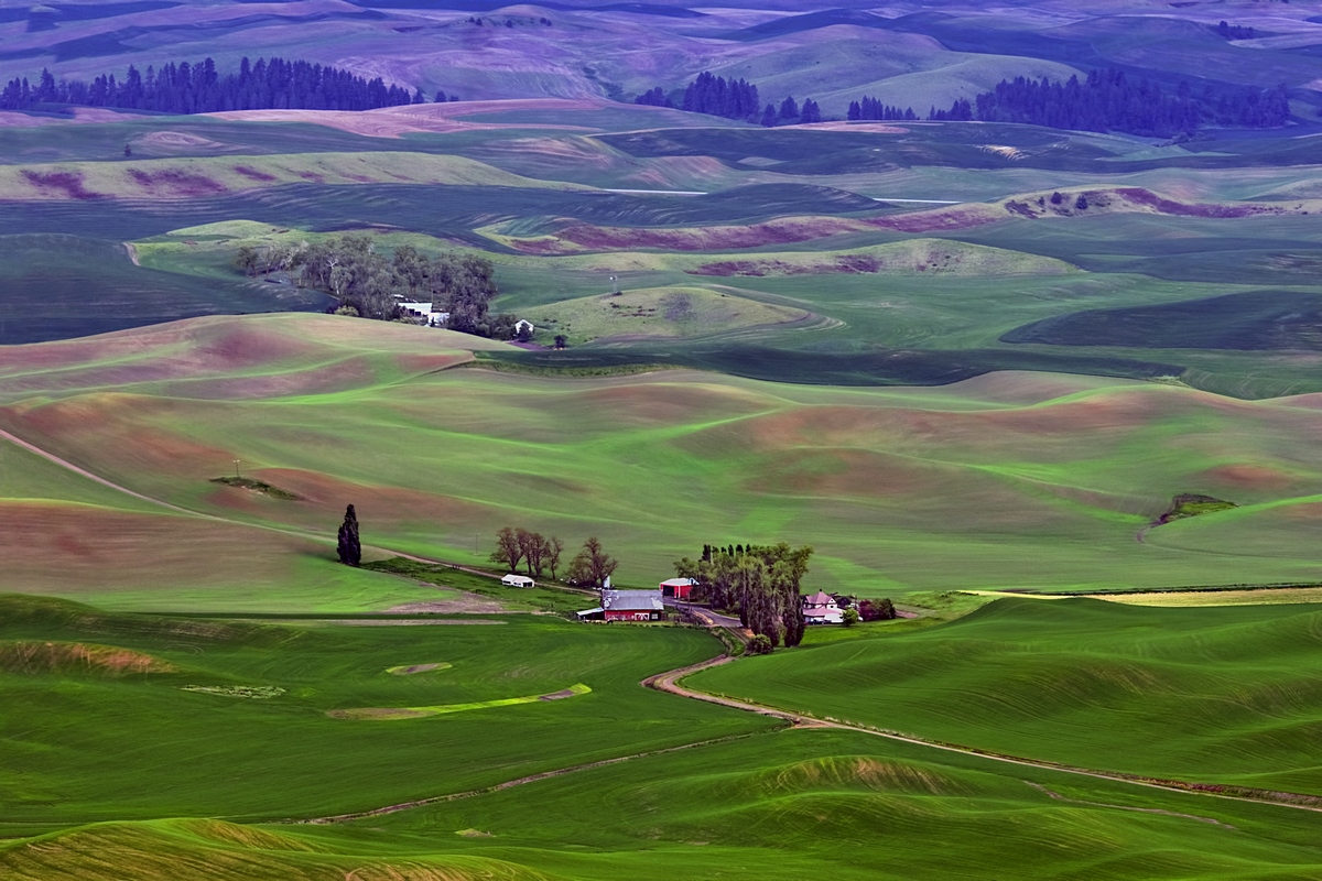
The color has always bothered me on this one. It's a 3-file HDR, processed here through Photomatix with "photographic" preset selected.
After the challenge, I started from scratch and re-processed selecting the "natural" preset. I think it's better? But the bi-color look is natural to the scene and still there.
Statistics
Place: 30 out of 107 Avg (all users): 6.0156 Avg (commenters): 7.3333 Avg (participants): 6.1224 Avg (non-participants): 5.6667 Views since voting: 659 Views during voting: 114 Votes: 64 Comments: 8 Favorites: 0
I think the original colouring is fascinating. And someday I want to go there and see this amazing place for myself. Someone else recently showed a Palouse view.
The use of a bicolor filter is a little harsh. Unless it's real! With all these processing techniques one gets intrigued. What's real and what's not. In a landscape it's more important. The main thing is that it looks forced.
Bump for the sweetness of the landscape





 Add photograph to your favorites
 Add photographer to your favorites


 Photographer found comment helpful.


