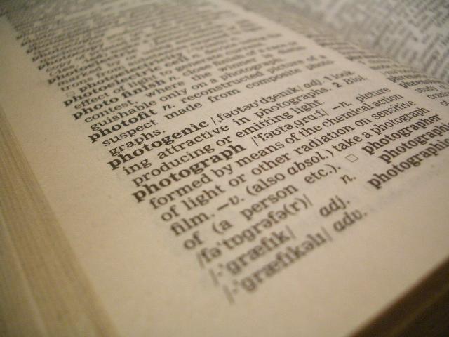
The DOF is just a *touch* off, as it seems to highlight photogenic more than photograph. Could have used a little work in the white balance as well I think, as the pages still seem a bit yellow.
This has good composition but the DoF makes the photograph description blurred, despite the title making it the subject of the photo. Also it could do with a touch more contrast in post processing.






 Add photograph to your favorites
 Add photographer to your favorites


 Photographer found comment helpful.


