Author Thread Comments Made During the Challenge
Post actions
Post actions
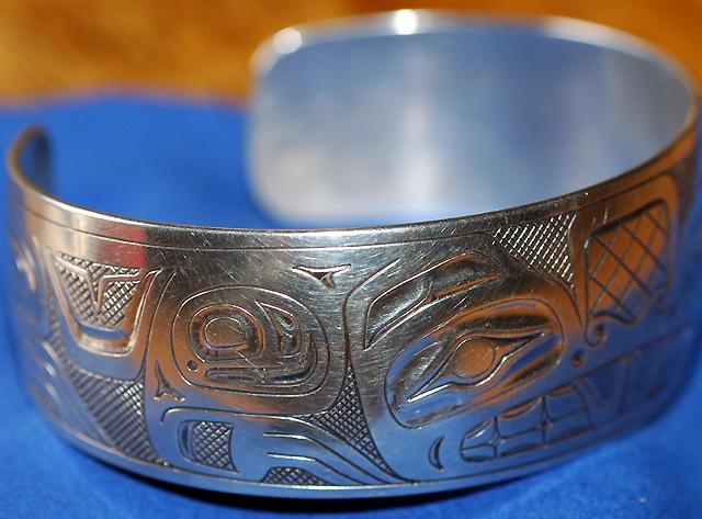
a little too tight the crop, specially on the right hand side, looks like you left some of the subject out even tho you actually didn't.
Post actions
The dual toned background is distracting. Excellent sharpness in this shot.
Post actions
Nice focus and color. I would have scored it higher if it had been cropped more at the top so the table wasn't showing.
Post actions
Lovely subject. Blue is a perfect choice for the background, but it would be nice if it filled the space behind. A light tent would help minimize the harsh shadow and hot spots which pull the eye away from the work of interest.
Post actions
This could be ok if you had taken the time to make the background not so distracting.
Post actions
The DoF is good, but I dont like the colours all reflecting on the silver. This would look better in B&W I think.
Post actions
That brown backround is distracting, next time try to have it all in one colour but other than that an allright shot, nothing spectacular though.





 Add photograph to your favorites
 Add photographer to your favorites


 Photographer found comment helpful.


