Greetings from the Critique Club.
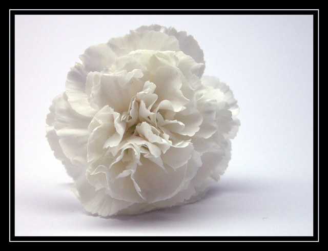
This is a very nice photo. The simplicity of it is what works for me. The color is nice and I really like the soft look of it too. I think I would change the border as it is a little awkward for me. Other than that it is a great photo and I can't think of a way to improve it. Good work and good luck in future challenges.
The flower is wonderfull: it's variation of "whites" and its texture are great. The background is a little to bright in my opinion, but I have to honest that I do not know is a darker background or even a colored one would do better.
Still a very good picture, like the frame too. Good luck to you.
Plain and simple - yet also elegant. Great focus and wonderful lighting on this flower. The border is also cliche, yet appropriate. I might have tried something other than awhite background, but I like the white anyway. Interesting choice of composition - it works really well.
Probably a bit too plain & simple for me. Technique and composition are excellent, but it lacks that extra something to make it stand out from the other flower shots. I can't help but thinking that a touch of colour (a stalk maybe?) would have given it an extra edge.
A good shot anyway.
a little too plain, and not quite simple: i have a thing about white objects against a white background, and the ripples and waves of the petals twist and bend more than "simple" suggests. otherwise nice, very nice.






 Add photograph to your favorites
 Add photographer to your favorites

 Photographer found comment helpful.


