You're Australian too! I can tell :).
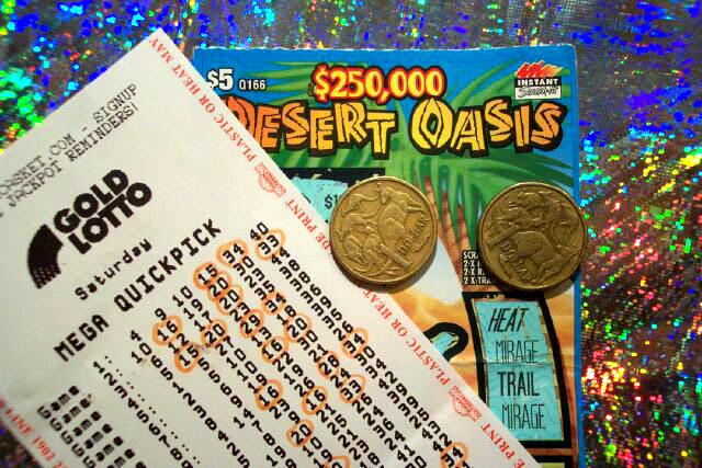
This is colourful and on theme, but I think you should study composition a little more. It doesn't seem tight to me. The lines are a bit awkward, and the sloping ticket pulls the eyes out of the photo. The coins stablilise the composition a little, but not enough to make it pleasing to me. It's also a flat photo, taken from an angle directly above. There is no depth. Try some from a lower angle, and if you have control over aperture, use a wide one to get some shallow DOF. This helps with macro setups like this to tighten the composition and draw the viewer's eyes right to where your focus is. |





 Add photograph to your favorites
 Add photographer to your favorites


 Photographer found comment helpful.


