Originally posted by wbanning:
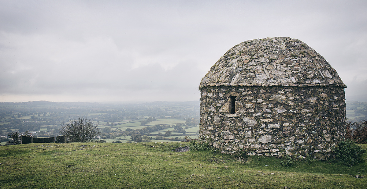
I like the muted color palette, which perfectly reflects the grey weather and represents the "landmark" without idealizing the the scene, There's a sense of place and surrounding space that's quite effective. I'm conflicted about the large amount of space to the left of the subject. While it does emphasize the expanse of the valley below, it also reveals the slightly distracting dark foliage and rectangular blocks on the near horizon - I wonder if it might be better to crop the left side in to the point of losing the darker objects. |
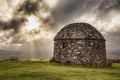
You are totally spot on about the space to the left. I prefer a tighter crop like a previous entry I had of the same subject:)
 |






 Add photograph to your favorites
 Add photographer to your favorites


 Photographer found comment helpful.

