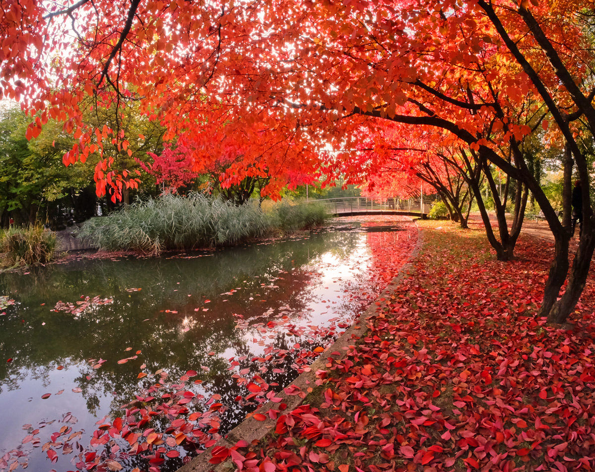
Barbara - I was one of your 4's on this image - obviously out of sync with the masses, but here's why I landed low on it:
There are certainly attractive elements here (graceful arcs of the river bank and the bridge echoed by the dark tree trunks to the right; the red/black contrast of foliage and tree are nice elements). The reds of the leaves at the bottom of the image are deep and opaque by virtue of having no backlighting. But the backlit reds at the top of the frame the are way oversaturated to me, to the point that they overwhelm everything else in the image.
But clearly my assessment doesn't align with the photo's scoring and ranking... and my tastes tend to be with monochrome or more subtly saturated scenes. That's what I like about DPC - there's room for all of us. Congrats on the 6+ score and excellent placing. |








 Add photograph to your favorites
 Add photographer to your favorites

 Photographer found comment helpful.


