Composition/ Content/ Background I like the fact that you've really thought about linking your image to the chosen month. That aspect of it is one of the stronger points for me.
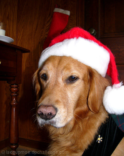
As has been said a few times in the comments left during the challenge, a big weakness of this image is in the background. The table doesn’t add anything as the milk and plate on top of it are too heavily cropped to be considered as part of the main content. In any case they aren't needed to convey the Christmas theme so would be best excluded.
The stocking at the back interferes with the colours and lines of the dog's hat and again would be better excluded. The scarf that he's wearing doesn't really match the hat and just introduces a thick black diagonal to the frame that doesn't really help composition.
All in all my advice in terms of improvement would be to really think about the background as much as the foreground and possibly even use a one-colour backdrop.
In terms of the lovely dog, it's a shame he isn't looking directly at the camera. It emphasises the impression that he's not really having fun but just sitting obediently whilst he's used as a model. Stronger eye contact would improve the connection felt between viewer and dog.
Camera Work - Technical Lighting is very harsh and has resulted in some large blown out areas in the white of the hat. Including large areas of white in your image requires more care with exposure, something that is definitely not easy. Perhaps softening the light source and also bracketing on exposure might help on this front.
Digital Processing - Technical Some confident cropping (at top and left) would exclude some of those distracting background elements and improve composition.
Personal opinion here: I am not big on animals in costumes. We have a golden retriever, and they are such beautiful dogs. The dog's expression seems sad and disengaged. I do like how crisp all the textures in this photograph are. The wide variety of those textures is interesting.
The background is distracting and the flash is a little overpowering. If you would have cropped much closer on the dog, the photo would have been more effective for me. 5
Great expression here. "Oh great. Chrismas again! Ho hum." hehe. A little over exposed in the white areas unfortunately, but a nice calendar shot none the less.
Nice shot :) 2 nitpicks... the stocking in the back seems to be growing out of the pup's head... And the color of the wall blends too much with the fur... Ok, one more... I notice the milk glass and assume it has cookies next to it for the big man... Maybe this could have been a bigger part of the shot? More prominent?
Awww, there that adorable puppy is again. At least I think he's the same one I've seen before. And he will get a high vote from me like always. Very cute picture. May have been a little better to clone out the background objects. They are a little distracting, but only a little.





 Add photograph to your favorites
 Add photographer to your favorites


 Photographer found comment helpful.


