Taken with the 70-200mmf4L
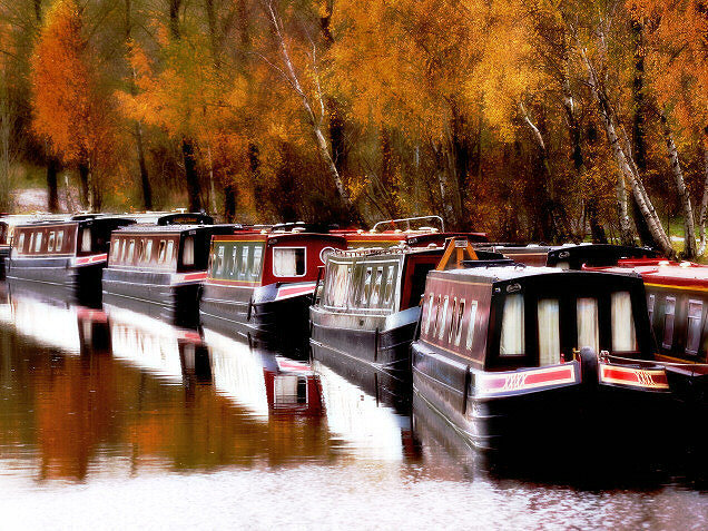
Adjustments to contrast(curves)to darken shadows and exaggerate highlights.(which will probably get commented on because of the loss of detail in these areas..but I do like the effect)Saturation increased on yellow to heighten the Autumn colours.Image cropped and resized then sharpened.A little dodging and burning
Finally a run through "NeatImage" at 50% to soften the foliage.
Statistics
Place: 23 out of 190 Avg (all users): 6.4472 Avg (commenters): 7.6818 Avg (participants): 6.1887 Avg (non-participants): 6.7419 Views since voting: 1475 Views during voting: 301 Votes: 199 Comments: 26 Favorites: 7 (view)
This looks like Gordon Whyte's trick with NI - most specifically in the resultant texture of those leaves. I can go with the kind of soft/non-soft feel of it for a calendar shot, but I'm not great fan of it photographically, I'm afraid. It'll garner a 6 though, for aptness, at least.
I don't like the treatment on this at all! (I know some people like it a lot). But this is my opinion.
The details are lost and the point where the boats are meeing the wate all all smudged except for the one that's the closest. I think I would have likes it bettter without this sort of treatment. I think it would have looked better with a more subtle treatment.
I think this effect that you used have improved the image, nice colors and good motive, maybe a little higher aiming of the camera would have improved the photo, with a little less of the water in the foreground and little more of the trees.
I like the soft focus in this image, only flaw in this image IMO is the blown out highlights of the reflections in the water. Great shot, one of the best in the challenge.
A perfect callendar scene. I might have preferred the trees to be less cropped vertically, but I feel this deserves an easy eight given the challenge scope.






 Add photograph to your favorites
 Add photographer to your favorites

 Photographer found comment helpful.


