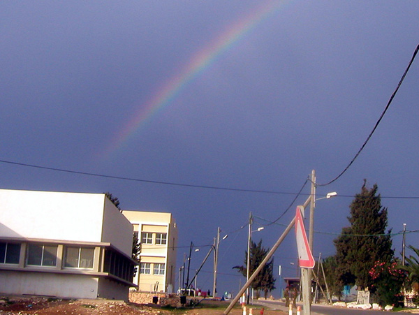
My pet peave in photos is when the horizon line is not perfectly horizontal when it looks like it was intended to be. Such is the case here. This gives off a very unbalanced feel to the scene which, for me, creates an uncomfortableness that remains as I view the image. If it is intended then tilt the image even more, if not then straighten it out. It is too easy to fix in an editing program that it should almost never be an issue.
Since there is a beautiful rainbow in this photo it is easy to gather that that is the main subject but instead of supporting the rainbow the surrounding subjects serve only to compete with it visually. This scene is unnecessarily cluttered and without a real focus. I feel it would have been much more effective to move somewhere else where you could show only a few of the surrounding elements while keeping the focus squarely on the rainbow. Using the yellow building against the blue sky with the rainbow may have provided some nice color contrast with the right composition. Maybe using the powerlines to mimic the shape of the rainbow would also work well. The key here is to greatly simplify the scene in some pleasing manner.
The colors are very good, bright and natural looking. It is also appropriately sharp and clean. I feel you met the challenge as well.
You had some very good elements to work with. You just need to determine what the primary subject is and eliminate everything that does not support or compliment that subject.
Aren't rainbows great! I think you've got a great subject here but the location you shot from detracts from what the focal point should be --- the rainbow! I would try also to keep the horizon straight across the picture so the viewer doesn't feel as if he's about to fall over.
Looks a litte cluttered due to all the stuff on the bottem... Takes the attention off the rainbow a bit... Perhaps if you cropped it and then increased the contrast...







 Add photograph to your favorites
 Add photographer to your favorites


