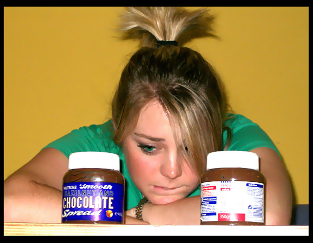
Red-eye reduction, brightness/contrast, saturation and hue, crop, border, smart blur and color balance. All comments are welcome, I just want to improve. Hope you found it funny though.
And thank you Megan for modeling for me.
Statistics
Place: 62 out of 108 Avg (all users): 4.9263 Avg (commenters): 4.8889 Avg (participants): 4.6197 Avg (non-participants): 5.1092 Views since voting: 1645 Views during voting: 433 Votes: 190 Comments: 10 Favorites: 0
I quite like the "painted" effect. I think you have handled the filter well. The composition works well and the girl's expression is very effective. I would love to see this image without the products in the way. I think her face is quite expressive and would make a good image by itself. Good luck.
Wow, her eyes are very very green. Compositionally, I think this shot is great. Technically, you seemed to have done so much editing that I can't truly appreciate it. I do like this picture though.
Good idea. My major issues are is the eye is really unnatural and weird looking (too green) and there is a lot of reflection and blown highlights on the bottles
This looks a little over-photoshopped... on the face especially. plus a flash right between the eyes... all negative factors with me. But a nice illustration of the challenge. 6. Edit: lowering to 4. This time i am using the full scale, instead of my usual 5-10. Also, i didn't mention a whole lot of blown highlights on the labels and caps.
Image critique: Not very appealing I'm afraid. Composition is OK, but lighting is flat (face-on flash), burns out the highlights and the shot suffers from sever sharpening and/or compression artifacts.





 Add photograph to your favorites
 Add photographer to your favorites


 Photographer found comment helpful.


