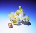
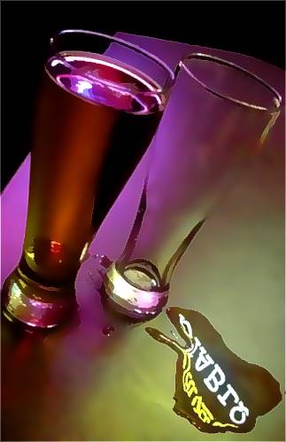
Cool filtering. Was it done with despeckle? It makes it seem like a watercolour illustration. The lines and colours in this are nice and bold. I really like it.
I like this alot, mine was similar but you took a different angle on it. I do wish that the image were more clear and crisp. Maybe it was the jpeg compression, for example where the empty glass meets the table, its blury or somthing. Also its a bit distracting were the white background meets the black. Just a thought.
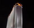
layout is nice. color is very nice. I like the effect of the sign in the wash on the table. a little over corrected in netimage, or photo shop. Image isnt sharp as it could be.





 Add photograph to your favorites
 Add photographer to your favorites


 Photographer found comment helpful.


