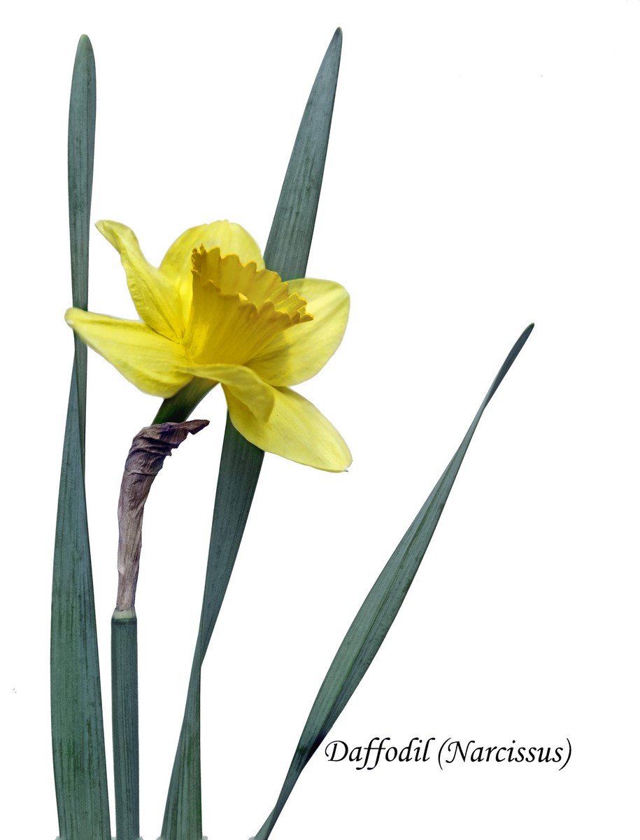
I was going for a kind of botanical illustration look, hence the text. I played with textures to give this an old book look, but was not successful - I could get what I wanted on the background but hated what it did to the subject so that was out in Advanced.
It's clear people did not like my idea and that's fine. I really do appreciate SC's jumping on the validation immediately to give this as much chance as possible. It was fun to set up and take, I like it, and I got several other compositions that I like, too, to play with; so I'm glad I did it despite the dismal score :)
Thanks to the commenters and especially to those who made it clear why they didn't like this - I always appreciate that.
Statistics
Place: 57 out of 70 Avg (all users): 5.0000 Avg (commenters): 6.5000 Avg (participants): 5.0513 Avg (non-participants): 4.9375 Views since voting: 392 Views during voting: 168 Votes: 71 Comments: 5 Favorites: 0
Since the photo was validated, you obviously did some trickery with the text on a sheet of paper. Interesting and very unusual approach. Unfortunately, it does not add to the effect of the photo at all :-(





 Add photograph to your favorites
 Add photographer to your favorites


 Photographer found comment helpful.


