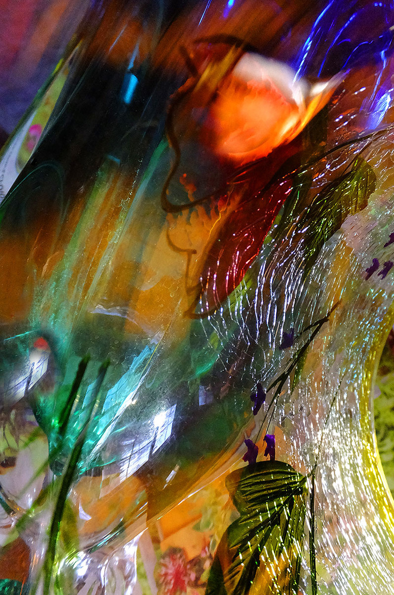
It works as an abstract for me. But then I start wondering how effective it is. It almost seems a bit too riotous. I'm curious what it would be like if it were just the upper right quadrant. I like the softness and sharpness of that part in particular. 6 as is. I'm wondering if it would be higher with just a selected part.
A lovely balance and appropriately titled, I think. The cracks make me feel sad but the curve is comforting. As I move to the left and take in the color, I am even more comforted. High marks from me.
like this, abstract but with lots of details to look at, the texture and shapes keep drawing my attention. The reflection of the window is a nice touch.





 Add photograph to your favorites
 Add photographer to your favorites


 Photographer found comment helpful.


