Yes!!!! Especially on the right. Had a really nice shadow going but there was too much clutter way in the back (my studio is too small!!!), and couldn't get rid of it legally.
Also, extending it to the right made it look off balance, as I had framed it so that the doorway was not visible.
I might reprocess this for myself, taking out the clutter and leaving in the shadow and a bit more space to the right.
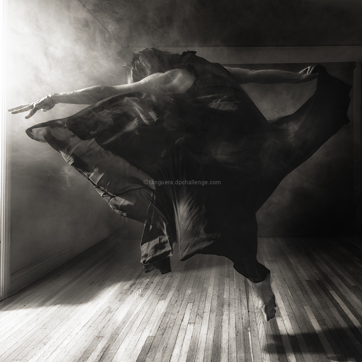
I did really well with the last natural light portrait - in fact, it remains my highest scoring image to this day. But I wanted to do something more dynamic, dramatic; something a bit more poetic and storied. The afternoon sun in the studio comes in like a blast through the kitchen door, and is so beautiful it makes my heart ache. I wanted the image to reflect that power and the wish that it would last forever.
As I'm in the (painfully slow) process of moving my office and rearranging my studio, I haven't been able to plan any shoots, so the only model available was, well, me. As usual, it is an art in itself to create an image like this while creatively hiding the remote trigger :)
My studio is over one of the garages-turned-workshop, and my sweetie was in there, working. All he could hear was this thumping, and thudding, and occasional cursing.
Statistics
Place: 1 out of 64 Avg (all users): 7.0615 Avg (commenters): 7.9091 Avg (participants): 7.3636 Avg (non-participants): 6.7500 Views since voting: 2458 Views during voting: 156 Votes: 65 Comments: 31 Favorites: 5 (view)
This is quite extraordinary now that I take a second look (should have scored it higher) but after reading your notes I can appreciate what you went through to accomplish this. I particularly like the smoke-like effect. Good job! Congrats!
Love the motion and energy this has, it's a very dynamic image. The smoke and the movement of the fabric and the pose of the dancer are spot on. I also like the fall off of light from the left to the right.
Beautiful work Johanna! Congrats on the Blue. B&W was an excellent choice here because when paired with the title, the audience thinks upon the dark and the light. I love the expression here of the dancer. She (you) dances with wild abandon, raging against the dying of the light, all the while she is constrained in the square frame. She dances despite being restricted to the box.
I think the genius of this shot for me is how expressive it is even without a face which for most of us would have been the starting point. The cramped space effectively intensifies the fearsome claustrophobia of inevitable death. Congratulations on the blue - my top pick too.
Ah, interesting comment and explanation about the small space. It was 8 from me and, what happens to me always with good pictures I look at them a lot longer and with a much more critical eye . In context it should have been a 10 cum laude. Does not seem too democratic but one always stops in a museum for longer looks or go faster.
I think that because of the advanced editing you should have gone drastic about the cropping, cut the toe, rotate a bit to the right and have her left hand go high, or crop her right hand that is less expressive and clear…
Her posture and left hand and dress are so wonderful, the streaming light so perfect, some dust, the angle formed by the ceiling in a perfect place ... that it might be enough to crop her entire right arm, dress and toe (the shadow to appear might be too much and take the focus on the light).
A blue ribbon yes.
And for yourself you might tweak it since it's a fabulous image.
I'm really wanting to love this one, but it's just not hitting me for some reason. I'm wondering if having more of the window/door visible. Or perhaps more to the right -- more of the shadow. Or cropped significantly up from the bottom. I think it's just because the arm and the hair and the light is fascinating, but the whole middle part just gets muddled and loses the interest, simply because it can't keep up with the rest.
Just thinking out loud, because I really wanted to find out why it didn't work for me. -6-





 rage against the dying of the light
 Add photograph to your favorites
 Add photographer to your favorites

 Photographer found comment helpful.


