Greetings from the Critique Club!
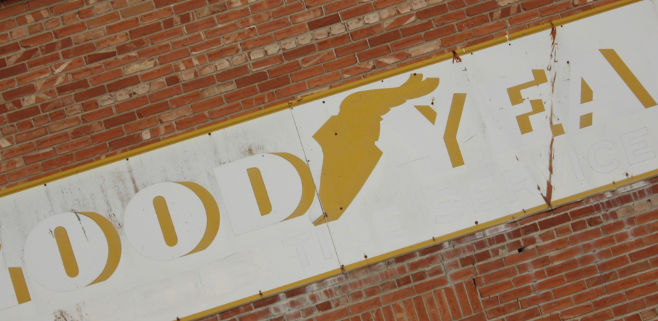
Hmmm this image is a very good try at the challenge, it is a truncated sign, and I don't mind the angle as I feel it adds interest. I think the main problem is twofold: a lack of colour, this could have used a hit of saturation to make the image pop a little more. Second, lack of a dominant element here; no one aspect stands head and shoulders above the rest demanding your attention. The winged foot is also somewhat centred, maybe a closer crop in to it would have helped draw more attention to it.
Hope this helps! Feel free to PM me with any questions.
Susan |





 Add photograph to your favorites
 Add photographer to your favorites

 Photographer found comment helpful.

