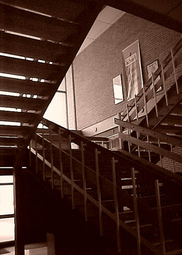
COMPOSITION... I find this area can be improved upon somewhat, depending on what kind of picture you are going for in the end. For an interesting abstract of stairs, I would try getting in closer and looking for a pattern in all those angles. Try a couple of different viewpoints and see what turns out. If you are trying to take a more pulled-back shot, i would choose another angle that obscures any distracting elements in the photo. For instance, the posters on the wall detract my attention from the shapes of the stairs. Actually, I think this is the only major distraction in this shot - Imagining what the photo would look like compositionally without these posters produces pleasing results. Also the photo is slightly tilted - you can use Photoshop's crop tool whenever you see your photo is slightly angled.
TECHNIQUE ... I'd only be repeating what's in the comments already here - I do find there is just too much shadows in the photo. I like the sepia look to the photo - regular color might have made it a bit too run of the mill. Anyway, overexposing the photo a little more would solve the shadow issue, or as Olyuzi suggested, using reflectors or firing your flash could have also solved your problem.
OVERALL.. A very good first attempt. Welcome to DPChallenge!.. hope you enjoy taking part in future challenges!...
The bright door (bottom left) makes the whole image appear to be twisted, try stepping left to get it out of frame and maybe it'll allow a bit of detail in the dark area to come through. I like the shapes and the contrast in light-top dark-bottom.
Very interesting composition. It seems that the picture to be underexposed lacking in detail in the bottom steps and under the bottom steps and I believe that it takes away from the energy of the picture. I would prefer more detaiil there. This could have been done by exposing for the shadows or with either fill lighting or reflectors.





 Add photograph to your favorites
 Add photographer to your favorites


 Photographer found comment helpful.