i think you had a great opportunity here bu it just didnt work out... it seems out of focus and the colors are much too washed out..a beautiful hillside lacking the WOW! these types of photos really need to have vibrant colors or it just doesnt work
Good vantage point (position to take the photo from), however the yellow leaves on the bottom are very distracting and should have been cropped out. On the left side of the image there is a dark line.. i am not sure what it is from, but it is also a bit distracting. The image looks very soft and sort of washed out, i think it could have benefited from a boost in saturation and contrast.
I think i know what you were trying for but i dont thing you were able to acheive it. There seems to be the wrong kind of haze in the air and the lighting is not right. 5 Kevin
The colors look beautiful. In my humble opinion this was not the photo for a foggy day. Don't get me wrong -- I like foggy photos -- even entered one myself, just think it muted the beautiful colors here, tho. :)
The colours are very soft in this and it almost looks like the image is out of focus. I fyou have photo shop, you may want to try increasing saturation levels and using the "sharp" or "unsharp" mask tool to make the image pop. Another suggestion - this is a beautiful scenic. However, sometimes adding something just to the right or left of the foreground (a tree, a flower, something like that) can really bring the viewer's eye in - the eye looks at an image in almost a circular way - starting with the main subject (something in the foreground) and then moves out to the rest of the scene. Employing this technique may bring your results up in future challenges. I think what you've tried here is very nice though.
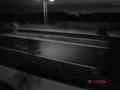
I am hoping this image is somehow a mistake, perhaps you downsampled it too much when making it this size but the quality of the image is horrible, soft, full of artefacts and noise also, it looks like it´s taken with a cellular phone with a camera.
Anyway, it would probably be a great shot if it weren´t of this poor quality but I cant help but give it a 1.
This image looks very soft - looks like it was taken from behind a dirty window. Does even look like it's a small area of a much larger image. Also, there's a grey line on the left of the frame, which can be avoided with cropping that bit out. To make this one better, perhaps you could try using Unshark Mask (if using Photoshop) or any other tool in any other software designed to sharpen the image.
I am still wondering why you didn't get rid of that grey line! :) Best of luck.







 Add photograph to your favorites
 Add photographer to your favorites


 Photographer found comment helpful.


