Greetings from the Critique Club!
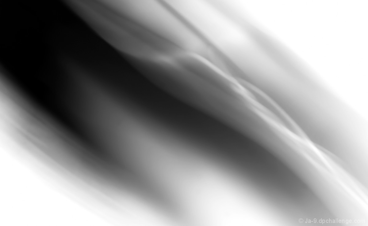
Nice use of a strong diagonal to give it a dynamic look, mostly good tones but a little too close to the Land o' Clorox for my liking in the upper right and bottom left. I do like the smooth curvy undulation in the middle (a leetle too close to the safe zone but at least it's a focal point), definitely gives it the sense of fluidity as promised in your title. Maybe voters were a little frustrated by the lack of colour and not being able to tell what kind of fluid it was meant to be - wine, tinted water, tea, coffee etc.
Hope this has been helpful, feel free to PM me
Susan |








 Add photograph to your favorites
 Add photographer to your favorites

 Photographer found comment helpful.


