This would easily fit into either of this weeks two challenges.
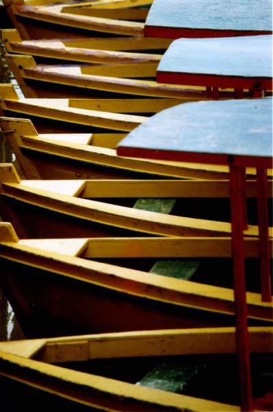
The repititous pattern is very interesting and appealing.
I like the way the light and shadows contrast, emphasizing the design. The colors are not real bright, but that's fine. Subtlity is nice too.
Perhaps the crop is a little tight. A little space between the bows and the edge of the picture would be better, I think.
Over all a nice picture.
Regards,
I liked the repeating pattern. Maybe you could have repeated the covers as well or eliminated them? The soft focus distracted me. Keep up the good work.
I love the pattern here - personally I would have liked for the sharpest focus to be at the beginning of the boats - (these comments are so subjective) - its a great shot either way!!
Took some looking to figure this one out. This is different and nice. In fact each time I look at it the roofs appear to look different, looking life water, then like a roof, then like etc. Hope you can see what I mean. This is unique and I like it. Great initiative on your part and a well done photo.
Visual impact doesn't say much to me, perhaps if you had showed more photo to me? The overall color is okay, but only 3 of the boats are in focus. The colors do stand out bright enough, but is that enough?
Composition: Excellent choice of shape. The number of boats you have included seems to confuse the picture. I think I might prefer it slightly more open (not quite sure how).
Technical: Colours and lack of border are good. I guess the shot was hand-held making deep DOF difficult, but I think crisper focus would have benefited the end result.
Meets challenge: Holiday photo?
Overall impression: Good idea but let down slightly by aesthetics for me personally. 6






 Add photograph to your favorites
 Add photographer to your favorites


