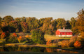
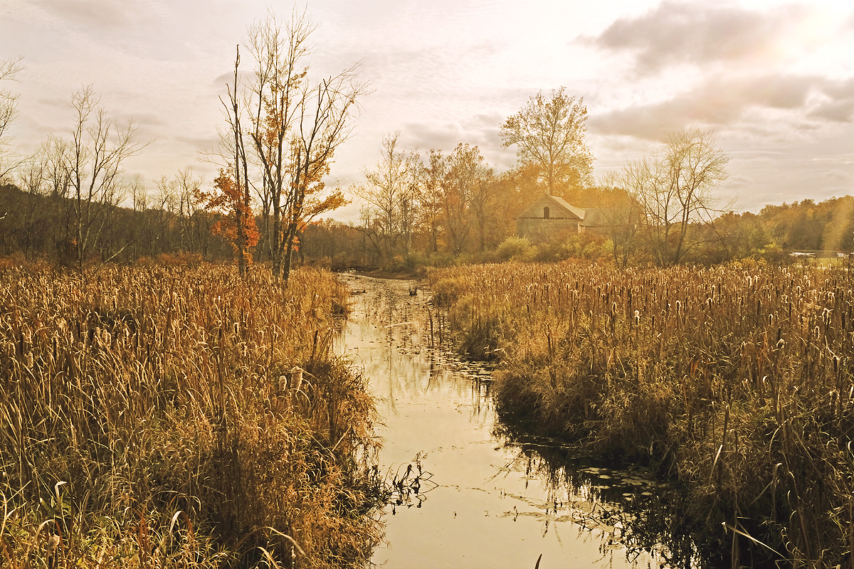
if this is anything other than eye candy, that was not my intention. I put shadow/highlight on a dark but beautifully lit image. then I put different curves on land and sky. then I used selective color to make the coloring warmer.
btw, it was dark because I got exposure from the sky. I was able to bring back detail from the land but overexposed sky would have been lost.
Statistics
Place: 18 out of 74 Avg (all users): 6.2933 Avg (commenters): 8.1429 Avg (participants): 6.4474 Avg (non-participants): 6.1351 Views since voting: 680 Views during voting: 153 Votes: 75 Comments: 13 Favorites: 1 (view)
Welcome from the Critique Club and wow, I get to critique a Don image.
If somebody asked me to describe a Posthumous image style this would not be it so firstly it's good to see you do other stuff Don ;)
As others have said, this has a painterly look to it and those muted colours work well. I do think the shadow/highlight has been used (almost) to excess but that is what gives the image it's quality. The building could do with straightening to my eye and you could have cropped some of the foreground out to give the image more of a panoramic feel (topical eh?) or even just a square crop from the right.
I hear you about the dark foreground and light sky and whilst normally I'd like to see more structure in the sky it works well in this image. I'm liking the light on the Bull rushes and can sense a Swan about to swim into view to finish the image off.
It's a print made from a painting at a rummage sale. Beautiful! Bumping to 8.
Reminds me so much of my Gramma the painter and of Vermont and places like that.
Have a red:





 Add photograph to your favorites
 Add photographer to your favorites

 Photographer found comment helpful.




