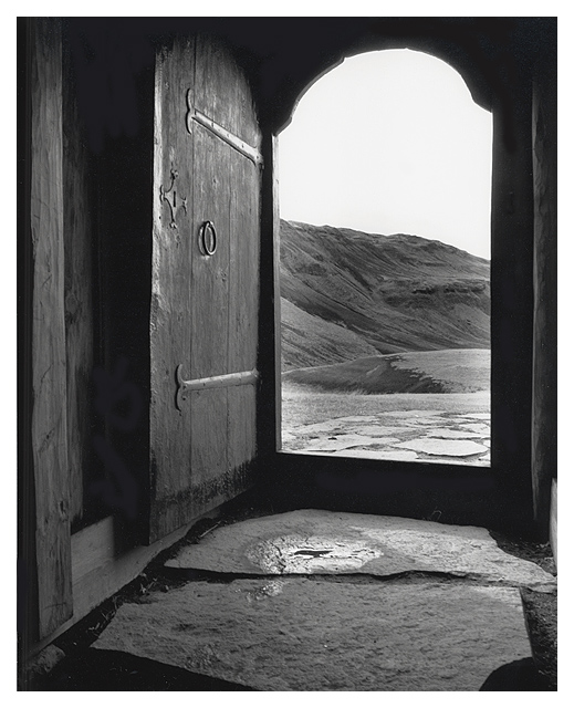
This is a great black and white in my opinion. The exposure is perfect.. the darks are dark and the lights are light without any blown out areas.
I really like the 'rustic' aspect of this photo quite a bit. The sense of age presented in this image is appealing to me. The ironwork on the door really sets it off nicely for me.
I have no suggestion for improvement of this image. I don't think what I see here could be improved at all.
One thing that could add a nice element to this photo would be someone standing in the doorway looking out... or maybe the shadow of someone outside on the door... just some thoughts...
Thanks guys. This is my third 4th place finish. I suggest we start giving honorable mention ribbons :) And no, it was not taken in Detroit, rather in a more rural area of Michigan. And who gave me that 1! Speak up :)
beautiful photo--one of my top pics this challenge! the only reason it scored a 9 instead of 10 was that i wanted just a tad more contrast, and i couldnt figure out the bizarre symbols/squiggles to the left of the doorframe--but not important! gorgeous depth to this picture. great work!
Wow, beautiful. It sets up a very interesting little world, and invites you to travel through it. Nice black and white, and strong composition. 10 from me.
I really love this shot except for one thing: I would have liked to have seen more contrast. Except for the top part of the doorway, it seems to have the same tone overall, reducing the impact that I think it could have had.
Wow, I really like this photo. I think this one will be in the top 10. I don't like the border but because it isn't obtrusive I won't mark it down. I just don't think it was nescessary to use. Good job and good luck!
Works good in black and white and the added little water spill helps direct the eye to an area that would have been ignored. A little to much glare coming through the door but I expect that couldn't be helped. Good Luck. JG





 Add photograph to your favorites
 Add photographer to your favorites

 Photographer found comment helpful.


