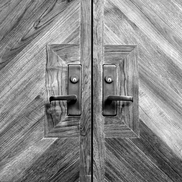
I really like this shot. I'm lucky this week because I have selected several good black and white images from the CC list... I like black and whites for several reasons. The absence of color forces the viewer to notice things that color usually hides. In this case, the wood grain becomes the subject of this photo. The wood grain contrast along with the symmetry in this shot make a really strong image.
To me, this image is not a 'door'. It's a collection of textures and contrasts...
Composition: Maybe would have zoomed in on the square part more.
Technical: Nice focus, colour and contrast. Texture of the wood looks great.
Meets challenge: Yes
Overall impression: Really nice and hard to fault. 7
This is a superb photo of a beautiful door. The wood is beautiful. The grain and colors of the wood are out of this world. I do hope you show it to us in color. I would have prefered it in color, to bring out the wood grain more. Whoever designed this door knew his wood and woodworking. In color would have been 10, as is it is still an 8. It's still an awesome photo.
Is it just me or do I keep seeing images similar images? I think I'm going crazy. I think you should have adjusted the levels to gove more contrast between the square that surrounds the locks and the diagonal pieces of wood.
Yes, this does work much better in B&W, the textures of the wood and that spectacular metal are enhanced a ton in this version. I am assuming you are a husband and wife team, you won hands down, IMO :). This was/is my only ten this week.
Great photo I love it. It looks so similar to another photo in this competition and I had to look very closely to see that they are not the same doors! Anyway great symmetry. 9 from me.
I like the decision here for B&W. Wood can look great when it's all warm, but here the grain is really accentuated when the image was desaturated. I also like that you make the viewer work for the square. Nice work.
What a great picture!...However, you have to dig in to find where the square is. IMHO, the door handles are the subjects, not the square. Good work though 7.
this is better than the other door that looks exactly the same but is in color. The black and white picks up the wood grain well and it is an interesting square. In my top 10
i like the optical illusion that happens here...if you stare at the middle of the square, the doors appear to move. there is a color version of what appears to be the same door...i don't feel that same illusion...it's interesting to compare the two...i definitely like this one much better





 Add photograph to your favorites
 Add photographer to your favorites

 Photographer found comment helpful.


