COMPOSITION
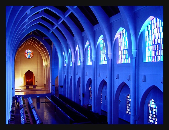
The composition of this really works to attract the viewer's eyes and draw them towards the altar. I think it is particulary effective that you can see almost all of the far wall, and very little of hte near one. The nice arch shape, that repeats with each of the trusses also adds to the drawing power of this shot. I know part of it is an "illusion" but it feels just tilted a bit to the left. Not enough to detract a lot, unless you sit and stare at it for awhile (which is what I have done to decide what to write), but once you notice it, it really is kinda weird.
TECHNIQUE
Simply awesome colors. Not just the blue, but also the different colors of the windows. Then, the front part really adds a nice contrast, and gives some warmth to the shot. There are a couple of spots that are almost blown out (up at the altar, and some spots in the window) BUT I don't think it necessarily detracts from the overall effect of the picture. He/She is not really noticeable, but if you could have shot this without the person, it would have given it an even more powerful/untouchable feeling to it.
OVERALL EFFECT
The blues to me make this shot feel really cool and isolated. Then the altar colors warm it up a bit, and become a focal point. Together, the colors and angle give this a very "holy" feel to it. Perhaps that is why the person kinda feels out of place to me. It looks almost untouchable, even. Of course, if you were wanting to depict that "sanctuaries" were touchable, the person is very necessary. Any way. A wonderful picture, and an awesome job!!! congrats on another ribbon!
Congrats! My heroine comes through again. I want to be just like you when I grow up. I know you love blue and purple but is this the actual color of the inside of this church or did you play with it?
This is an absolutely beautiful sanctuary. I hope the blue is the real color in this room. It is such a soft, safe feeling, relaxing, peaceful shade of blue. You can almost feel His presence in this photo. This is a 10 and should be 1st.
Amazing colours and great composition. It's odd to see such a bright, colourful depiction of a church. Makes it seem like religion can be fun, like a circus :P.
Wow, this is incredible! The repeating patterns and shapes are just awesome. The shot really conveys the imposing magnificence of the space. I'm not at all certain if the color is for real, or if all that blue is a manipulation, but whatever it is, it is inspired.
This is a nice photo. I really like the bluish color. Couple of things to improve are the windows are a bit overexposed as is the area down next to the altar. Maybe a shorter exposure time or longer one with a small aperture? Good work and good luck in the challenge.
stunning! the way your camera renders color differentials blows my mind, assuming that's normal sunlight and not blue light. could actually be a bit sharper in the foreground and there look to be a lot of blowouts... they're a little distracting although they add to the mood ....
Very nice image,color, and point of view. The only thing that is distracting is the light glare in the bottom left corner of the alter area. Excellent picture I hope you do well. John Gill
Great angle. Wonderful color and great DOF. Exposure is near perfect. I think exposed just a bit more would've made this picture better, slightly. It is excellent as is though. Great photograph and thanks for sharing it - Inspzil
Awesome color tone. You probably don't want to hear this but lose the dude on the lower left and it's almost perfect. The other thing would be to have it perfectly vertical on the sides, noticibly the left side. Try using Skew in PS or something similar, and since this challenge is open you could've edited out the dude too.
I love the blue tint to the structure and the contrasting pale orangish light on the distant wall. The clarity in the picture is remarkable! Is this place in the US?





 The Sanctuary
 Add photograph to your favorites
 Add photographer to your favorites


