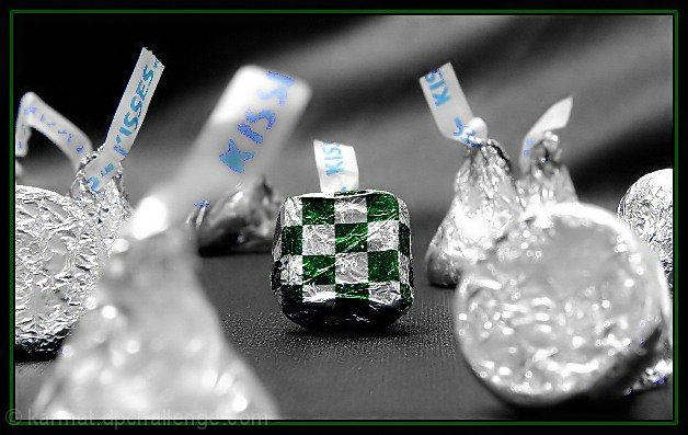
My first shot was of an actual hershey kiss (mint) but it made no sense unless you were familiar with them (most people aren't). Sooooo, I opened a kiss, shaved it into a sorta square, rewrapped and shot.
In post-processing, I adjusted the brightness/contrast some, and the saturation, in the "master" channel, as well as in the blues and greens. I like the effect that looks bw, except for htose two colors. It was completely accidental.
Applied NEATIMAGE.
I fully expect to get pounded this week!
Statistics
Place: 34 out of 179 Avg (all users): 5.8085 Avg (commenters): 7.6250 Avg (participants): 5.6389 Avg (non-participants): 6.0375 Views since voting: 1527 Votes: 188 Comments: 10 Favorites: 0
Greetings from the Critique Club.
This is a very fresh and creative approach to the challenge.
I like how you have the square stand out more by focusing just on it. I really don't mind the kiss in the foreground.
The compostion is nice and is very tight. You have very little negative spce, which I prefer. The only thing I would have tried to avoid is the Kisses label in the foreground. Maybe messing with your photo editor distorted it but I find it distracting. May removing that particular Kiss' label? I can't think of anything much to improve the photo. It is very nice but not I guess it just didn't stand out enough for some people to do better. Sorry I couldn't add more, please feel free to e-mail me if you have any questions.
Composition: Good. Really like the background and table surface
Technical: Fantastic focus, good use of colour, nice border. Looks like you've sharpened after you added the border not before (white line between pic and border). Best to do it before added the border.
Meets challenge: Yes
Overall impression: Technically great and aesthetic too! 8
Cool idea, I really like it. The border is excellent BTW. I think this would have been a lot better without the Kiss in the front left though. The writing and it's focus are a distraction. Good Job.







 Add photograph to your favorites
 Add photographer to your favorites

 Photographer found comment helpful.


